阿那亚 · 山谷民艺工房 | aranya · Valley Folk-Craft
ART DIRECTOR: Vincent Xu
DESIGNER: Niu Shuo
YEAR: 2025
CLIENT: aranya
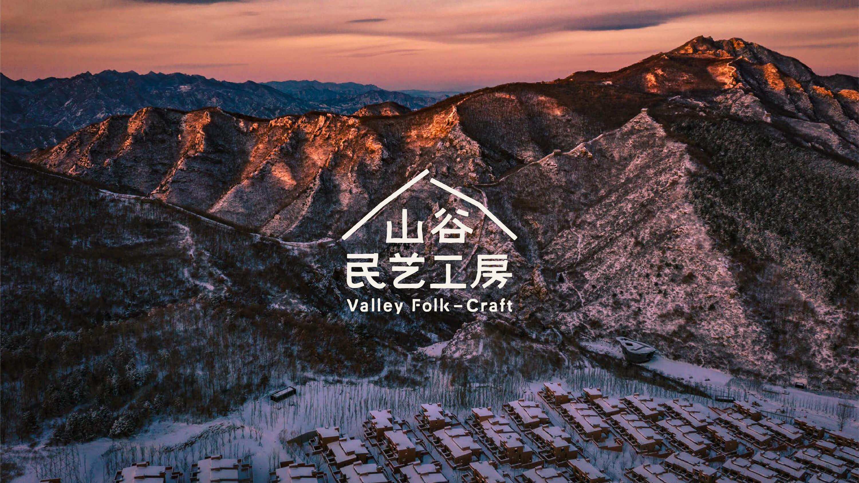
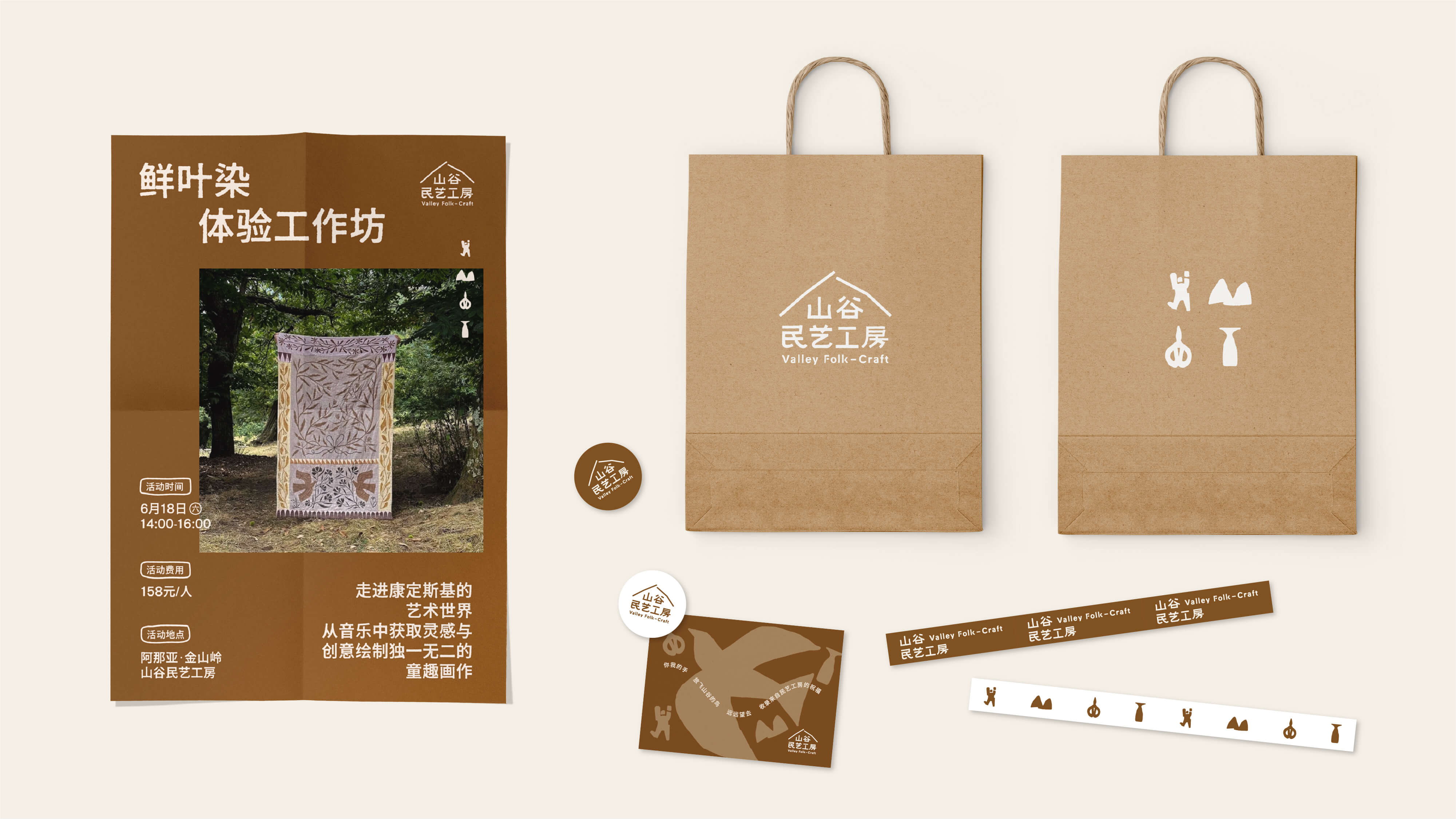
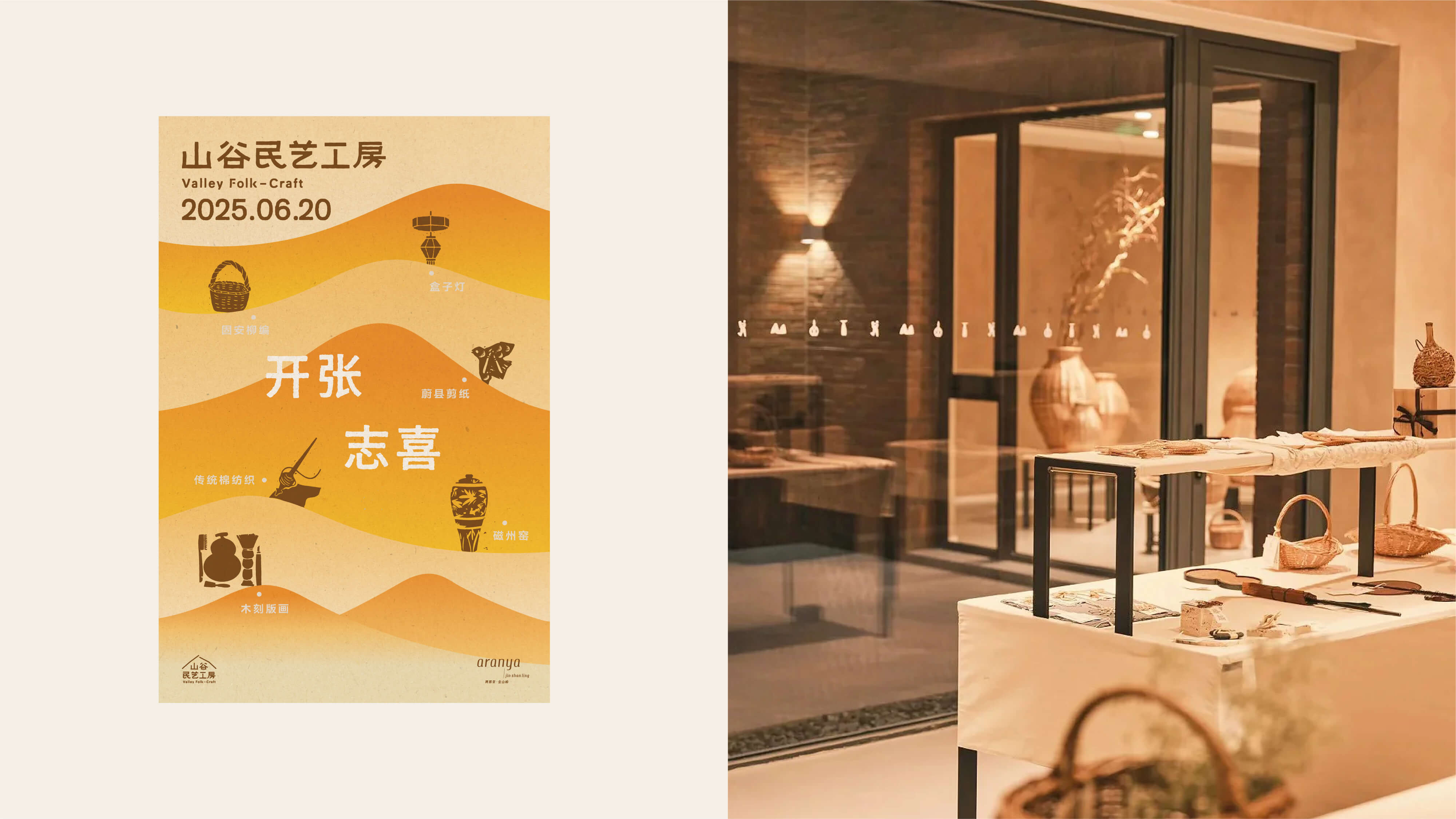
以非遗民艺为起点,阿那亚于金山岭展开一场连接传统与当下的探索,让民艺重回日常生活,绽放新生。山谷民艺工坊,便在此中孕育而生。
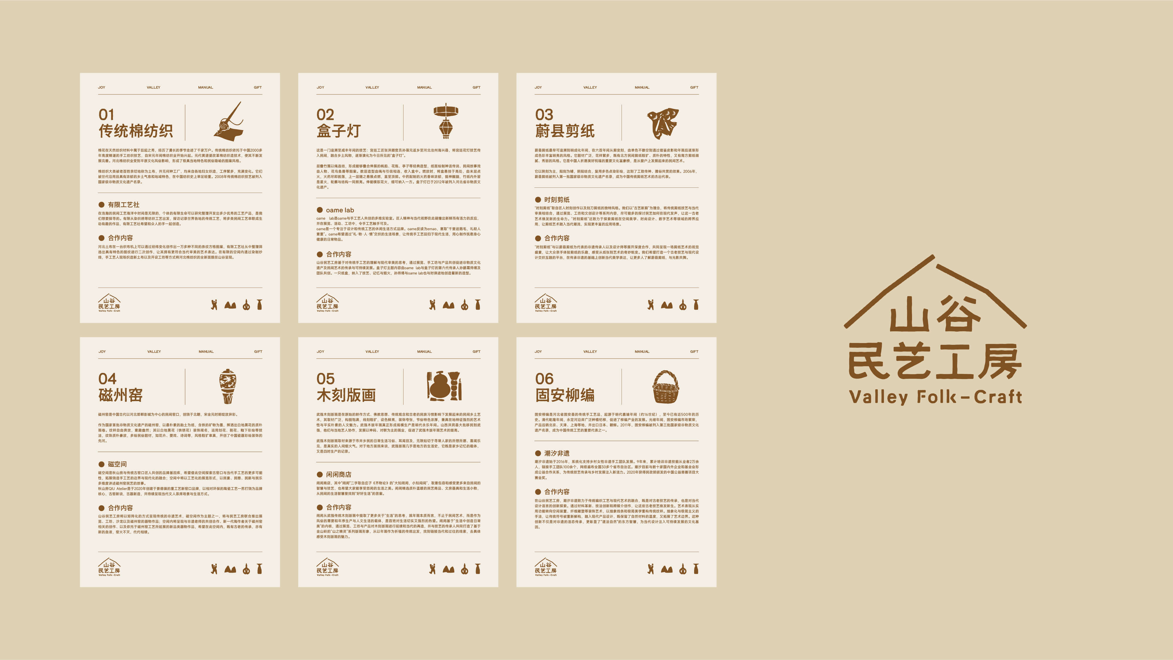
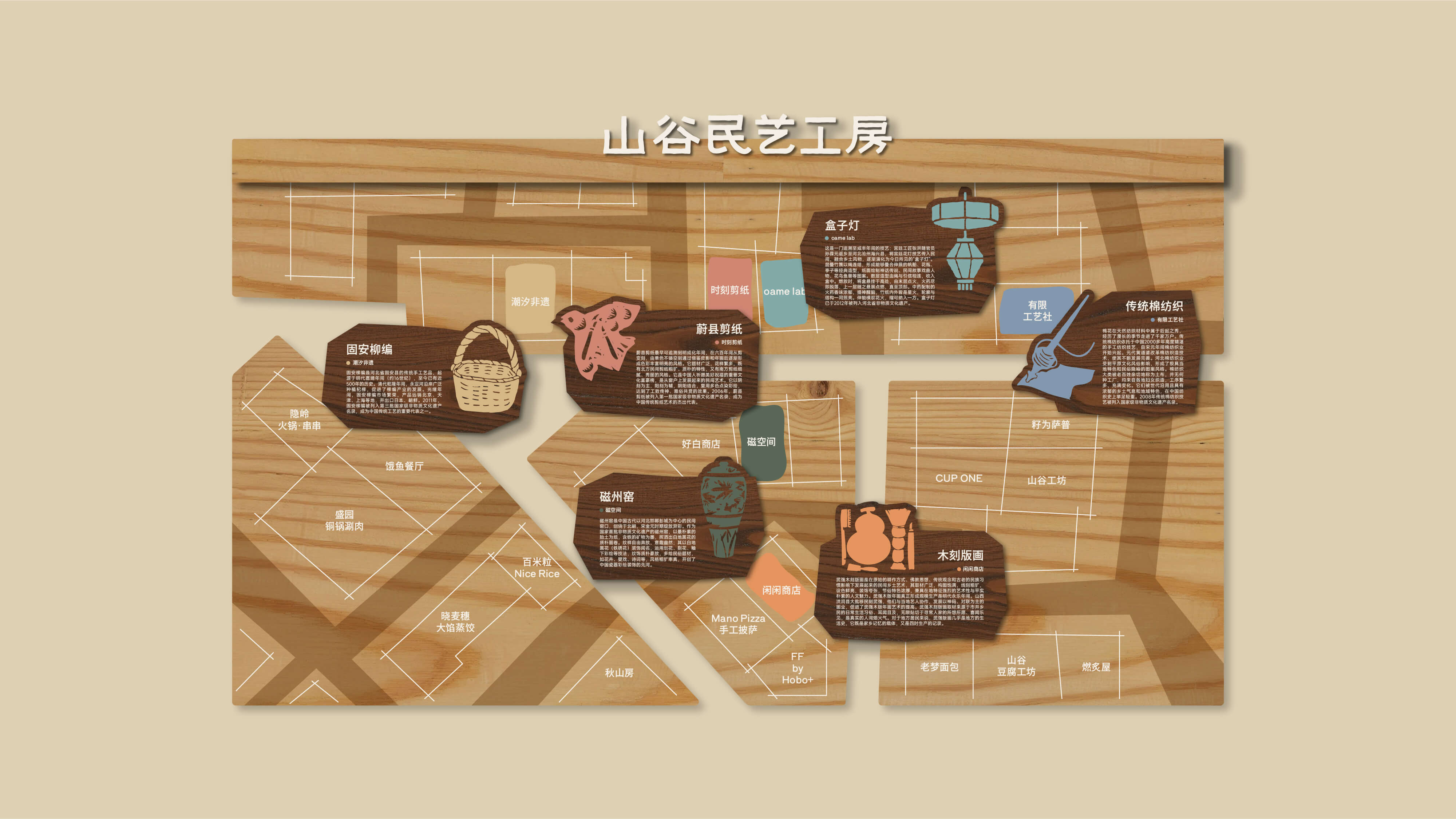
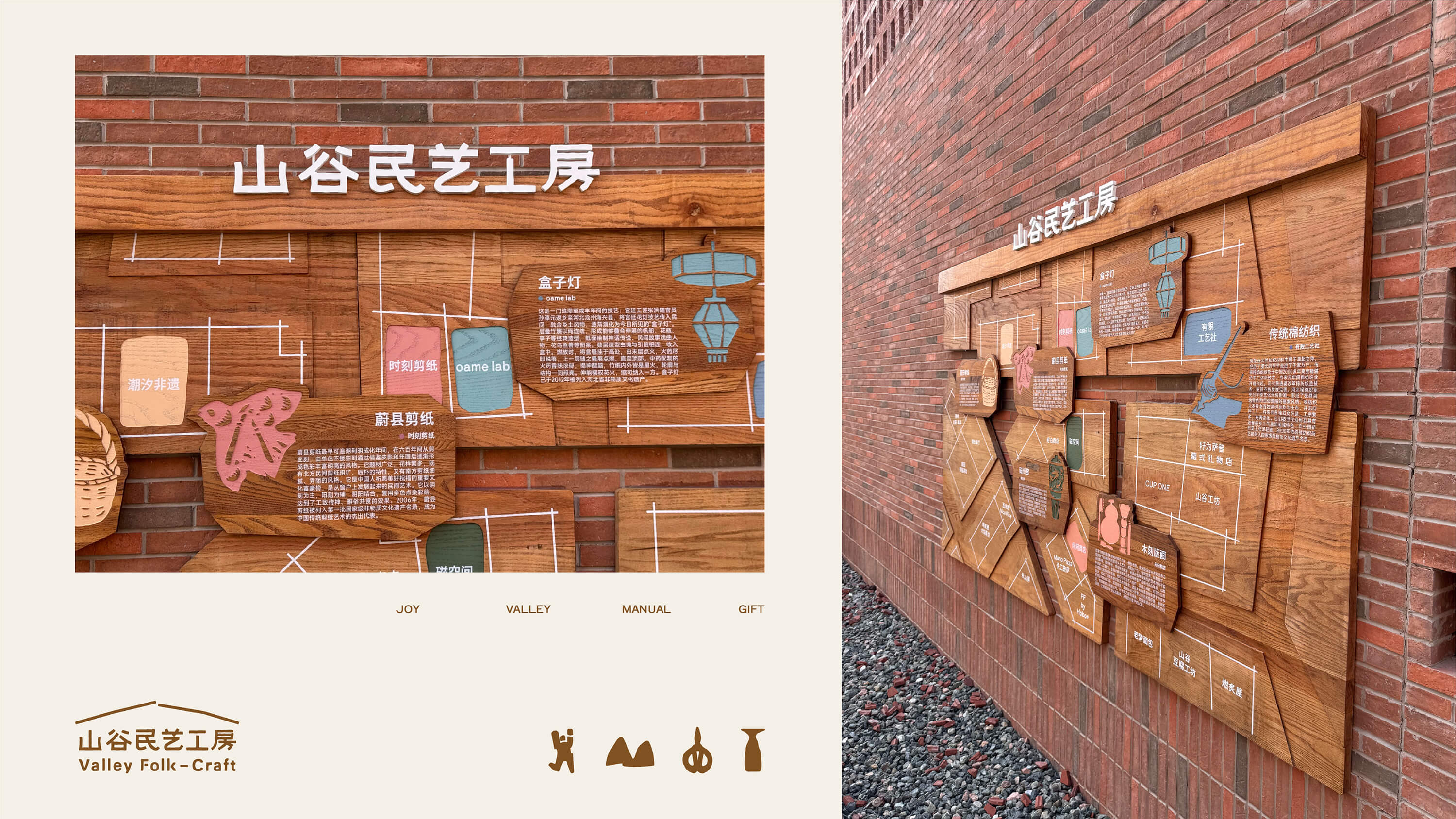
项目从河北在地非遗出发,选取六项底蕴深厚的技艺——河北棉纺织、盒子灯、蔚县剪纸、磁州窑、武强版画、固安柳编,我们与阿那亚团队共同构思,打造出山谷民艺工坊的品牌脉络。
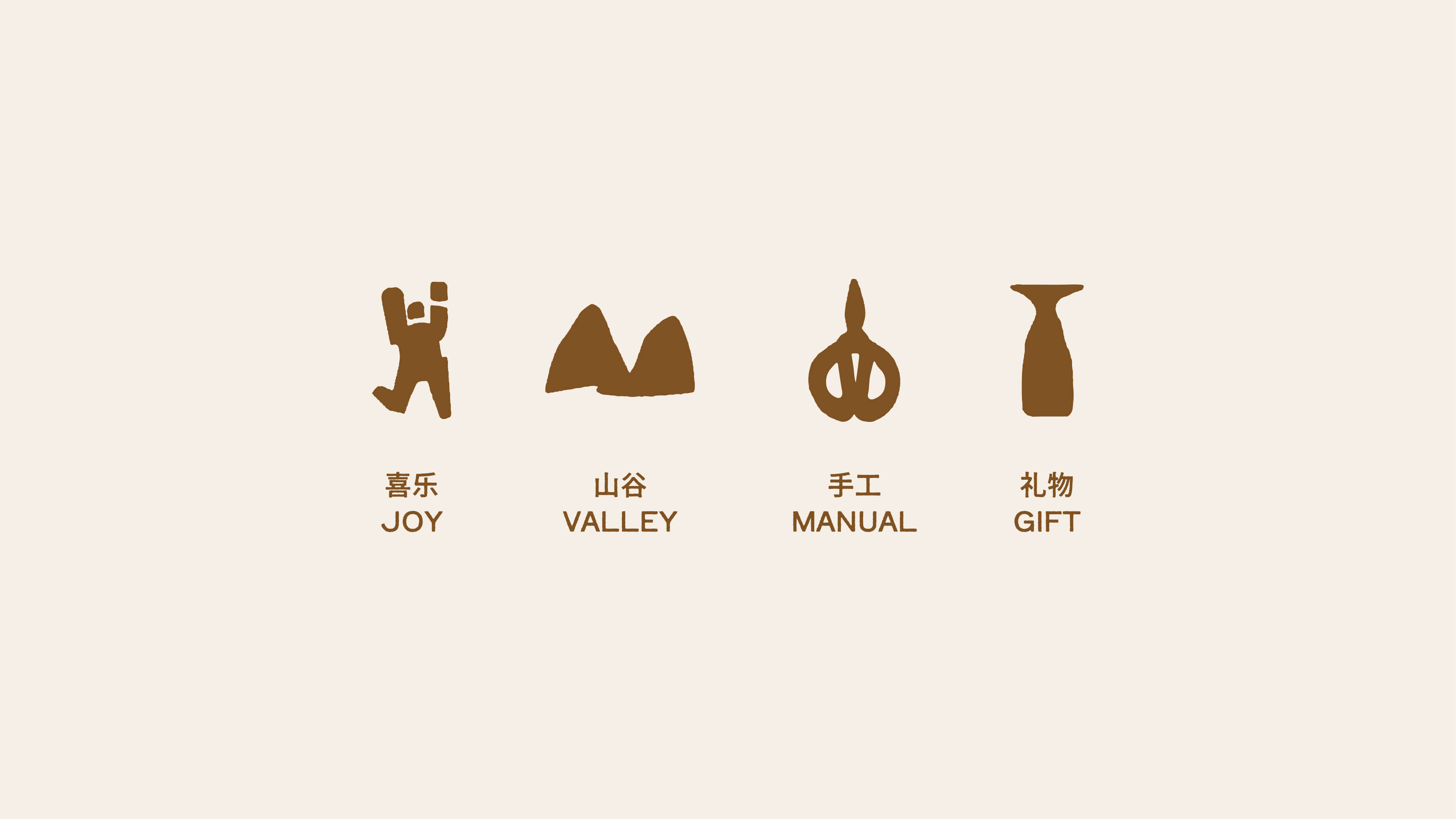
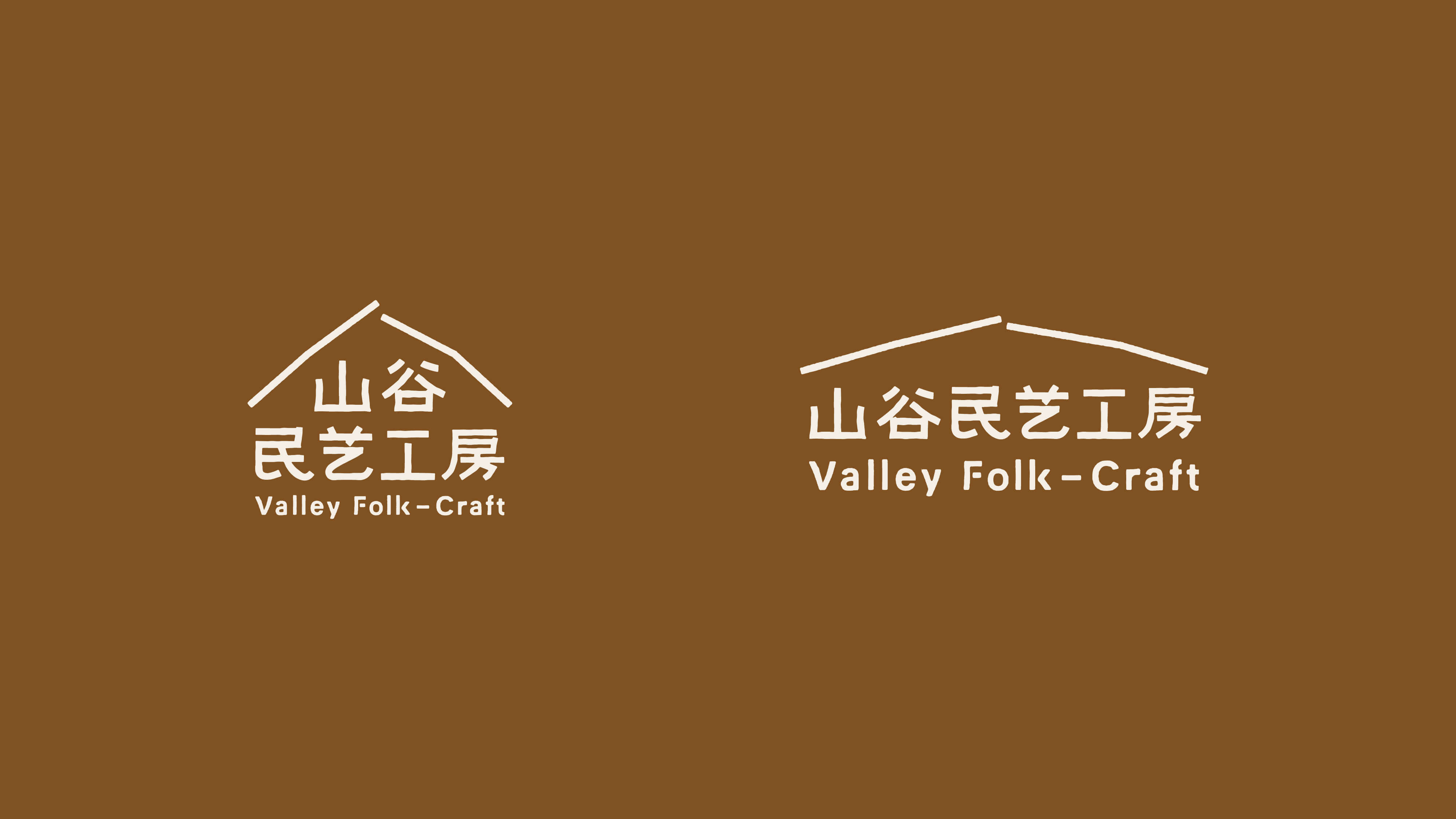
金山岭的苍劲山形,勾勒出品牌标志的轮廓;拙朴手写字体,传递出温暖的手作质感。喜乐、山谷、手工、礼物——在双手与材料的默默对话中,在“物尽其用”的朴素智慧里,收获一份内心的踏实与丰盈。
Starting with intangible cultural heritage and folk arts, Aranya embarked on an exploration connecting tradition and the present at Jinshanling, allowing folk arts to return to daily life and blossom with new life. The Valley Folk Arts Workshop was born from this journey.
The project originates from local intangible cultural heritage in Hebei Province, selecting six profound techniques—Hebei cotton textiles, box lamps, Weixian paper-cutting, Cizhou kiln, Wuqiang woodblock printing, and Gu'an willow weaving. Together with the Aranya team, we conceived and created the brand framework for the Valley Folk Arts Workshop.
The rugged mountain shape of Jinshanling outlines the brand logo; the simple, handwritten font conveys a warm, handcrafted feel. Joy, valley, handicraft, gift—in the silent dialogue between hands and materials, in the simple wisdom of "making the most of everything," one reaps a sense of inner peace and abundance.


探花灯·贵州菜 | HUES Guizhou Cuisine
ART DIRECTOR: Vincent Xu
DESIGNER: Qu menghuan
INTEROR : ZooCN Lab
YEAR: 2024
CLIENT: HUES Guizhou Cuisine
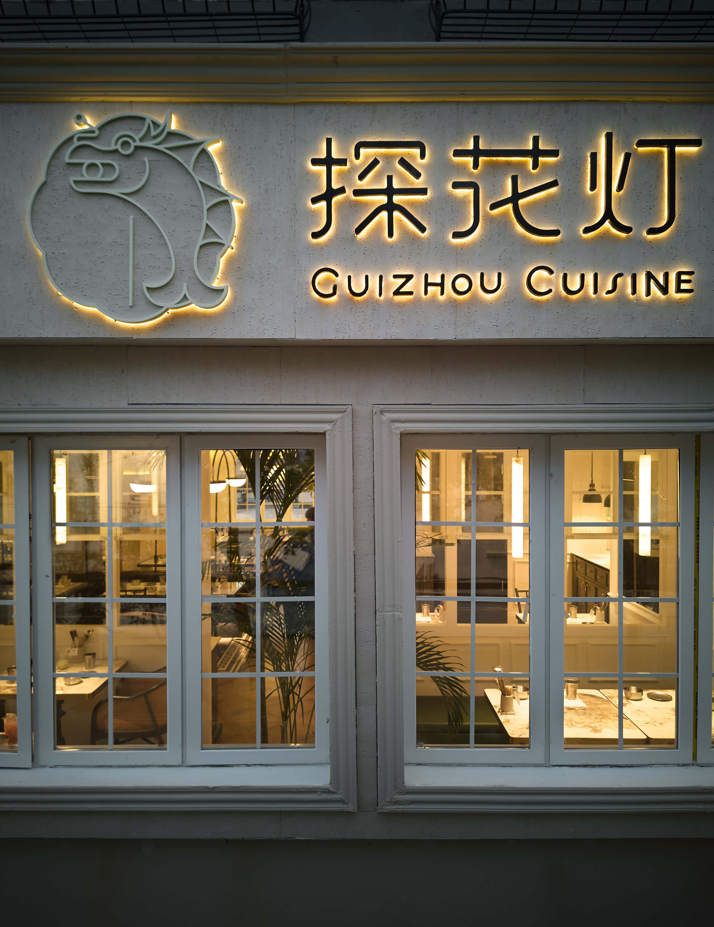
探花灯·贵州菜是我们最近落地的一家餐厅。在云贵菜系风靡的潮流中,如何吸引消费者是一个挑战。
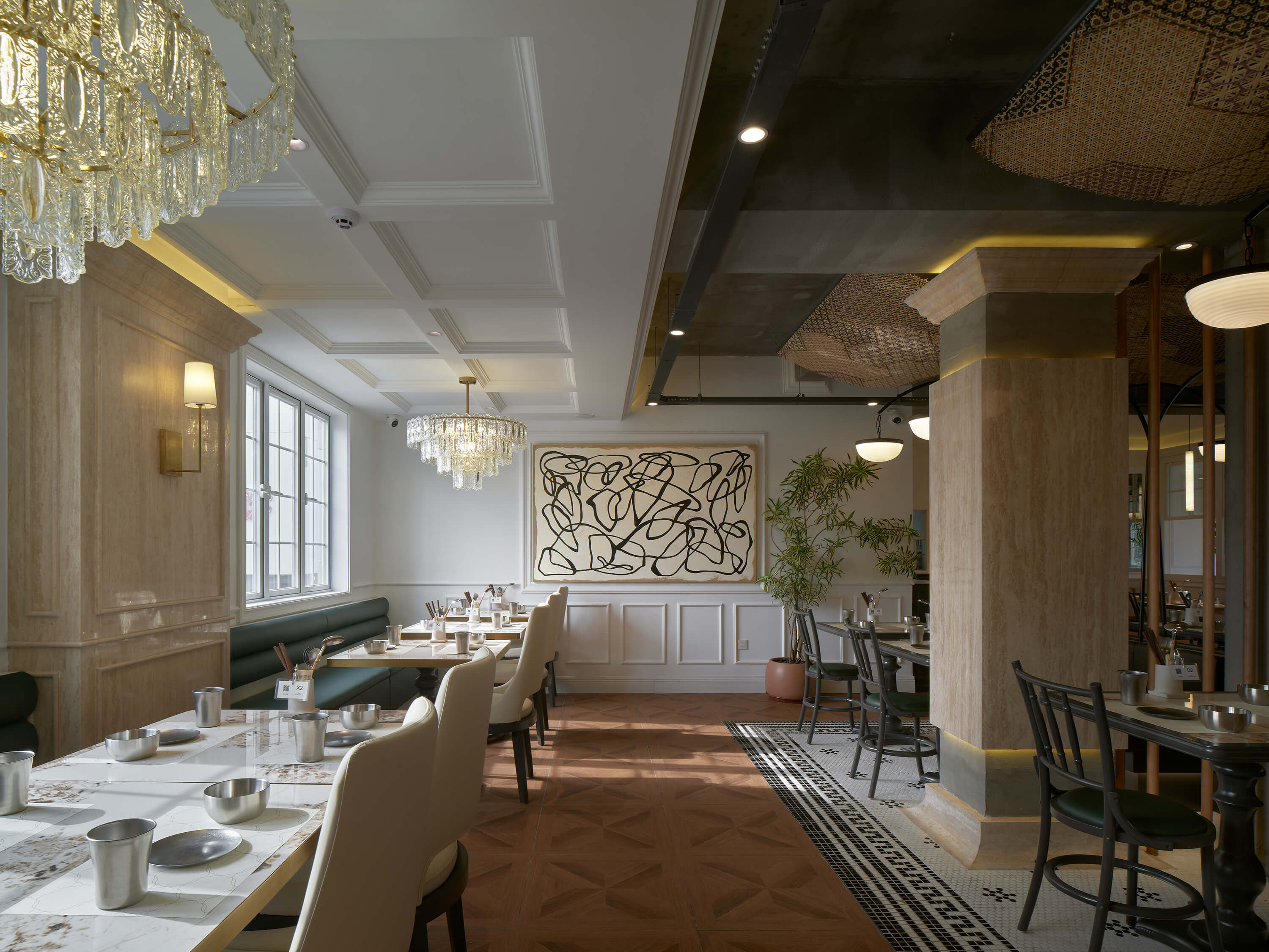
通过与主理人的沟通,我们了解到,探花灯致力于打造一家融合时尚与多元的餐厅。它既地道又不拘泥于传统,既具民俗风情又充满时尚感。想象一下,在一家欧洲复古餐厅中享用一顿酸辣的贵州菜,将会是何等新奇的体验。
花灯戏是贵州黔南布依族苗族的传统戏剧,我们从中提取了最具代表性的「鳌鱼灯」造型,并以简约的设计手法将其现代化和时尚化,实现了传统与现代的完美融合。多彩的花灯造型赋予了品牌多元化和强大的可塑性。
HUES·Guizhou Cuisine is a restaurant we recently opened. In the trend of Yunnan and Guizhou cuisine, how to attract consumers is a challenge.
Through communication with the owner, we learned that HUES is committed to creating a restaurant that combines fashion and diversity. It is authentic and not bound by tradition, with both folk customs and fashion. Imagine how novel it would be to enjoy a sour and spicy Guizhou cuisine in a European retro restaurant.
Lantern Opera is a traditional drama of the Buyi and Miao ethnic groups in Qiannan, Guizhou. We extracted the most representative "Aoyu Lantern" shape from it, and modernized and fashionable it with a simple design method, realizing the perfect fusion of tradition and modernity. The colorful lantern shape gives the brand diversity and strong plasticity.


Coconut Shake | 木双耳椰
ART DIRECTOR: Vincent Xu
DESIGNER: Qu Menghuan
YEAR: 2023
LOCATION: Shanghai
CLIENT: Coconut Shake
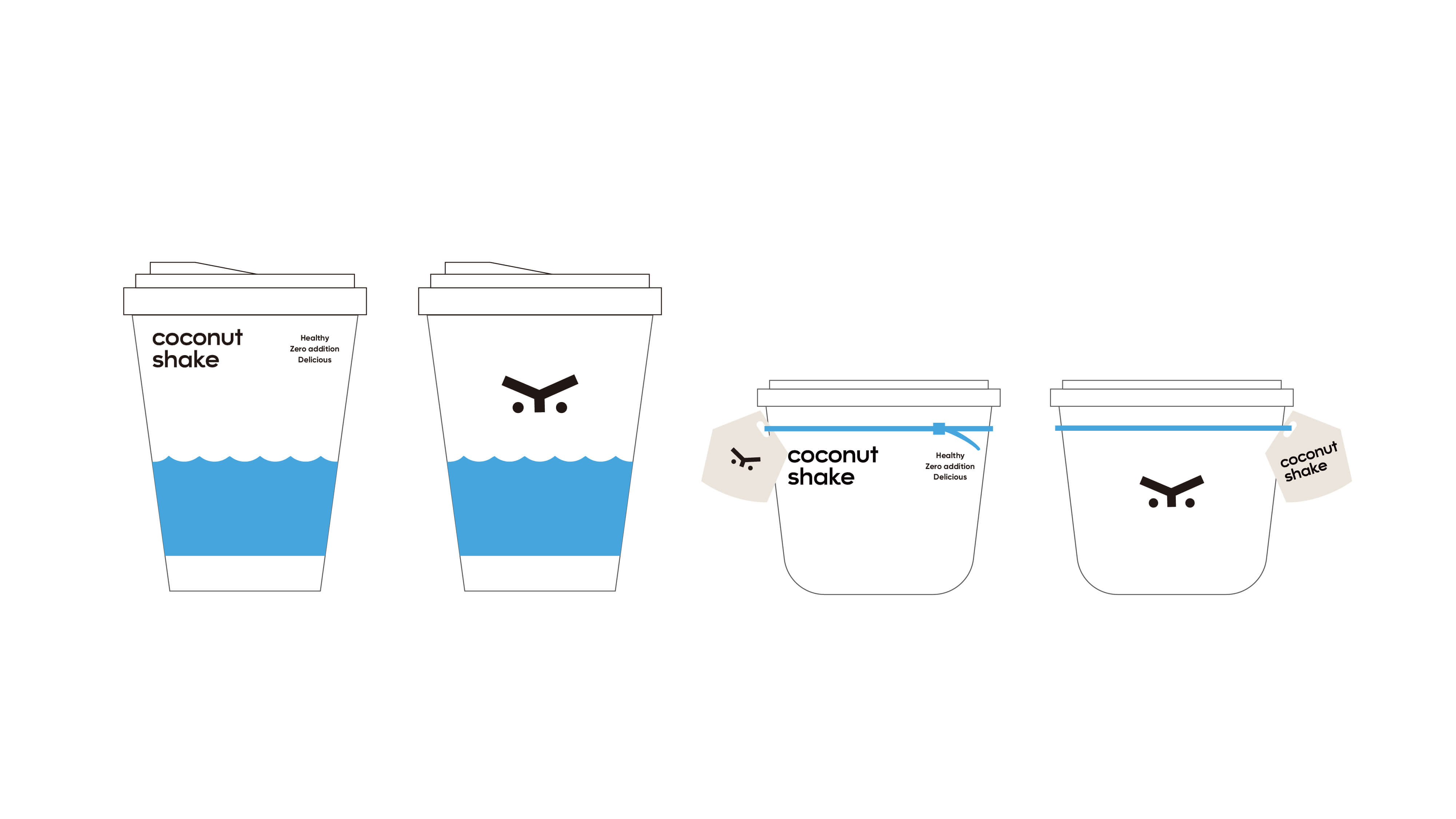
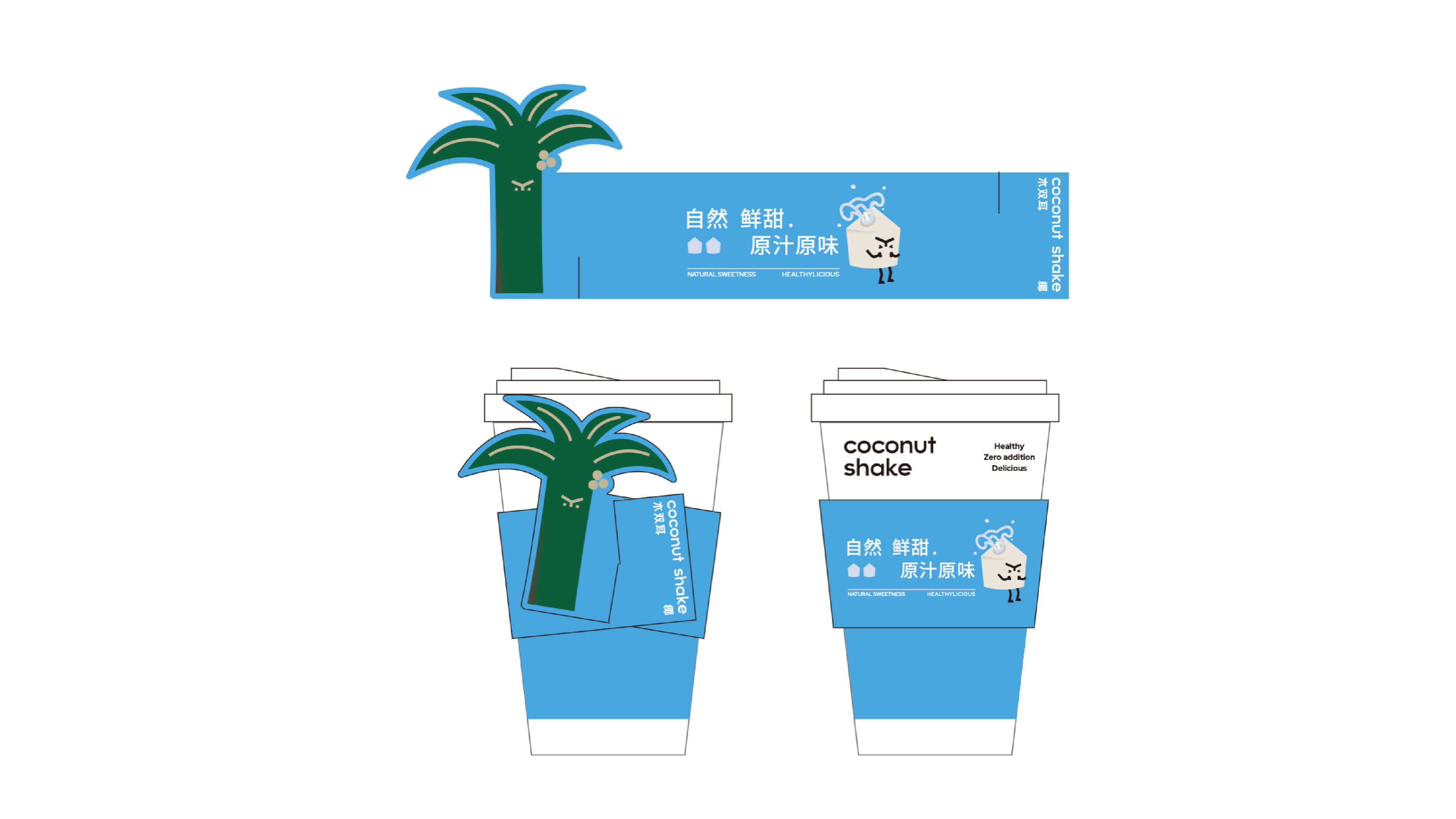
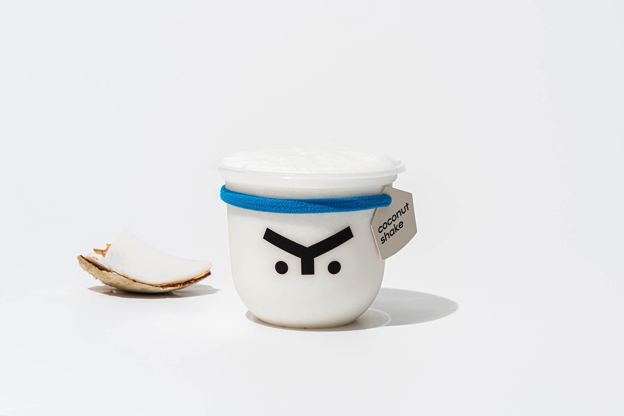
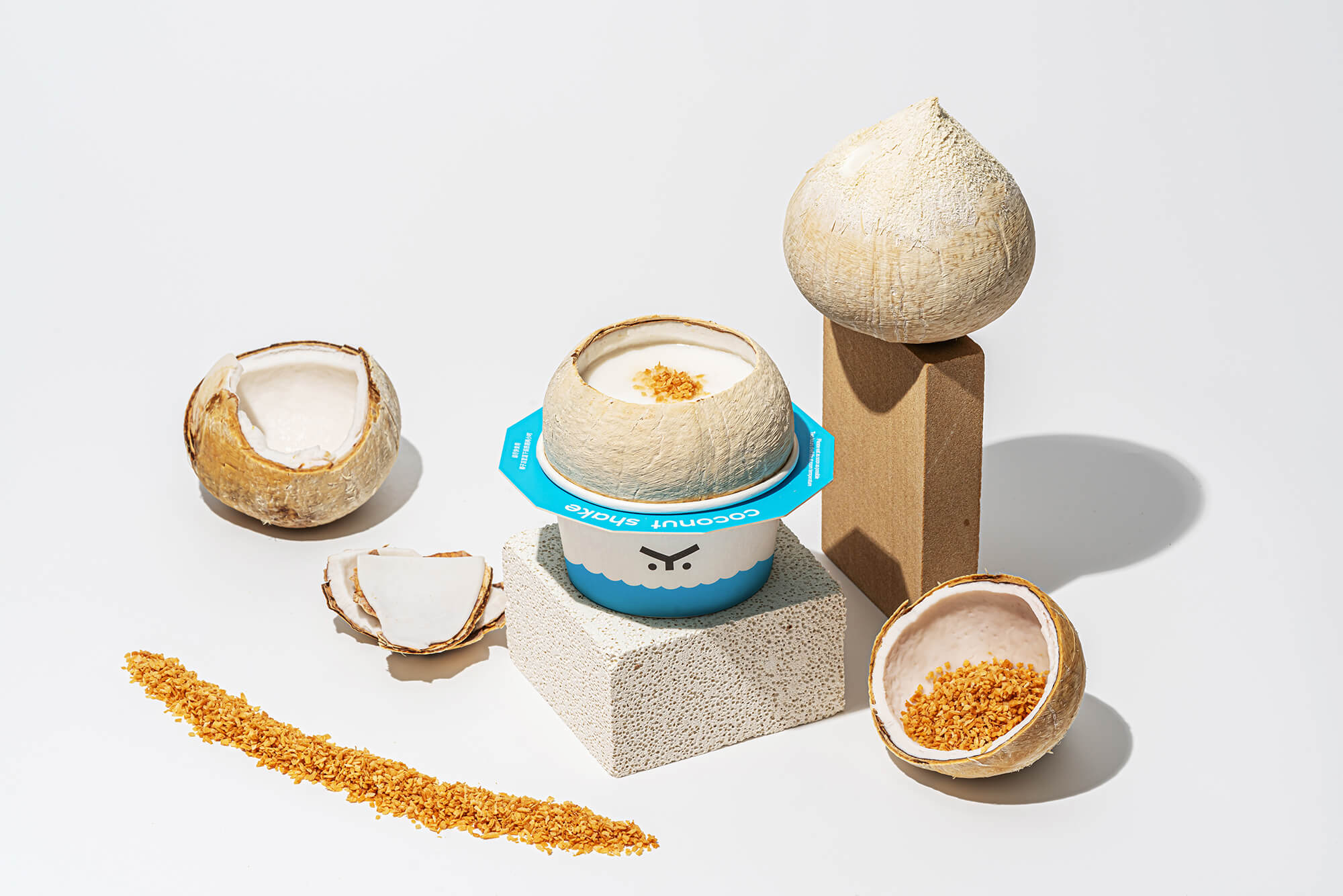
当一只椰子开始疯狂扭屁股,我就知道事情一定不简单。
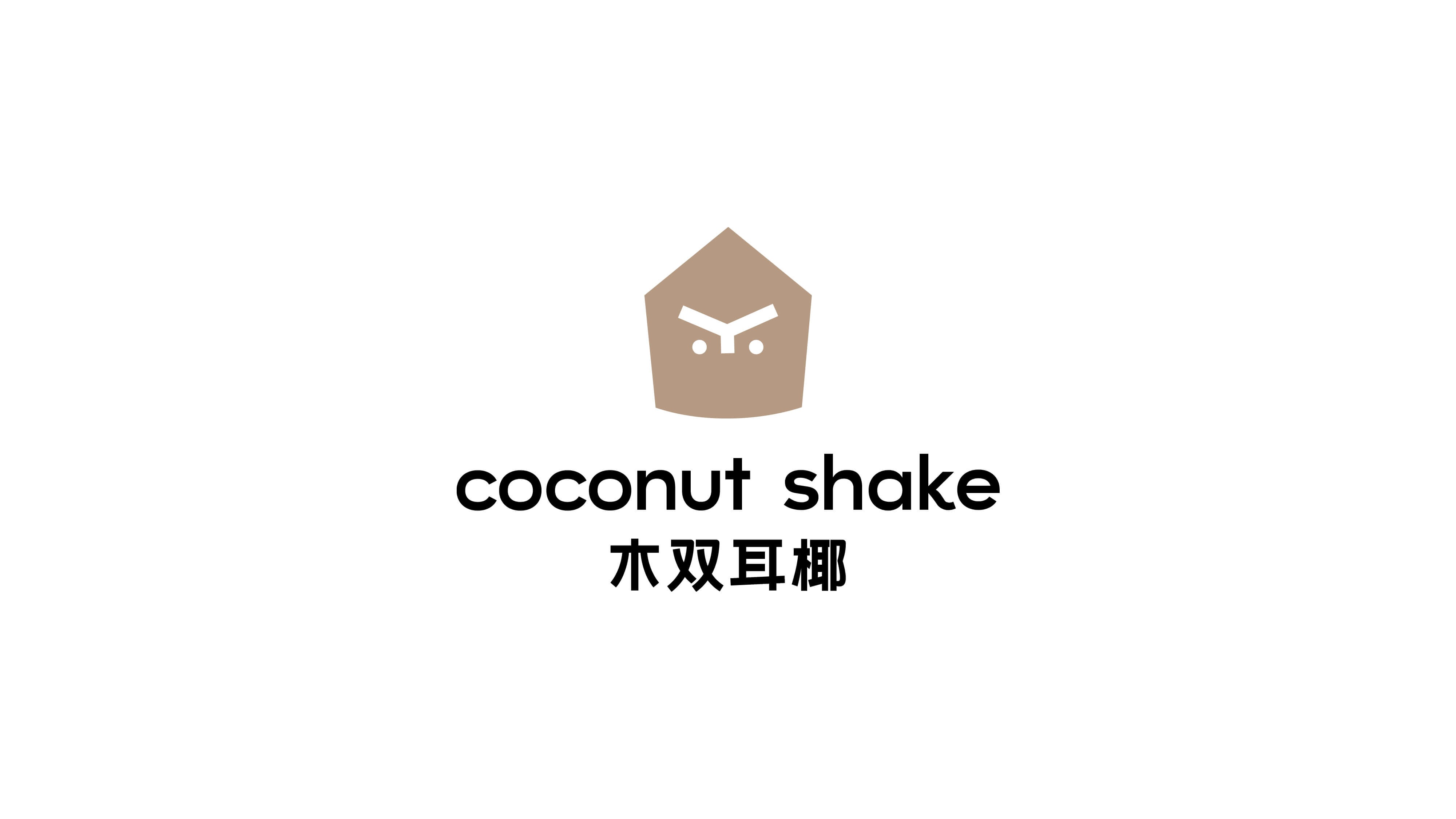
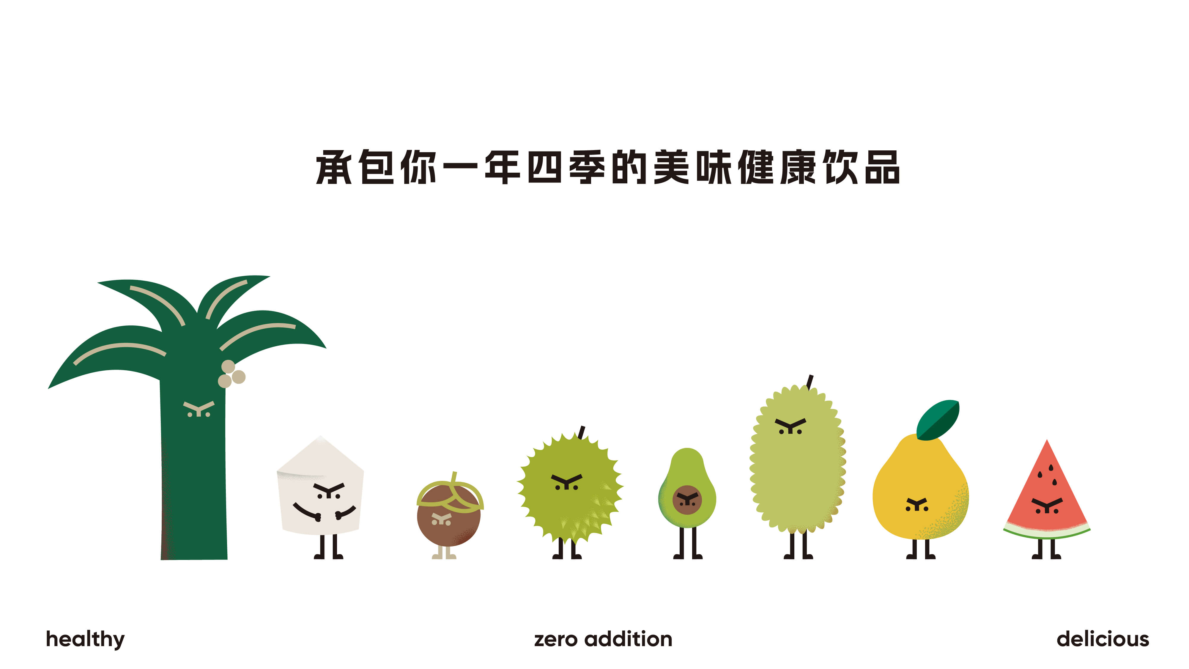
Coconut Shake 木双耳椰是一个以健康无添加为坚持理念的品牌,为了传达和凸显这一理念,logo图形为一个简约的五边形来代表产品核心椰子。
品牌字体也以简洁感,稳重感为主,呼应「健康无添加」的理念。
其次,从logo图形延展出可爱的椰子形象,并与其搭配设计了一系列的热带水果小兄弟,以此提升辨识度和活力,为消费者传达健康、轻松、快乐的情绪。
When a coconut starts to twist its butt like crazy, I know it's not easy.
Coconut Shake is a brand that adheres to the concept of being healthy without additives. In order to convey and highlight this concept, the logo graphic is a simple pentagon to represent the core coconut of the product.
The brand font is also based on a sense of simplicity and stability, echoing the concept of "health without additives".
Secondly, the cute coconut image is extended from the logo graphic, and a series of tropical fruit brothers are designed to match it, so as to enhance the recognition and vitality, and convey healthy, relaxed and happy emotions to consumers.


地心吐司|deysume
ART DIRECTOR: Vincent Xu
DESIGNER: Zhao Ang
LOCATION : Guangzhou
YEAR: 2025
CLIENT: deysume
地心吐司是一家位于广东的主打吐司的综合类烘焙店,当日现做不卖隔夜面包是地心的产品理念,主理人希望为地心吐司打造一套可爱俏皮的全新的视觉形象。
vi设计中的四个主要形象立足于1818年,小约翰·克里夫·西蒙提出的地心空洞假说,该假说主张地球是一个中空的巨大壳体,人类生活在这个球体的内部,所以我们所看到的日月星辰,浩瀚宇宙也都是在地球的内部,按照这种假说的逻辑,所谓地心即是太阳。
整个视觉设计将这个曾经风靡一时的伪科学当作一个故事作为背景支撑使其与品牌名称建立联系,再与行业属性进行有机结合,便诞生出了一个个生动的形象。
deysume is a comprehensive bakery located in Guangdong that specializes in toast. The product concept of the Earth's Center is to make bread on the same day and not sell overnight bread. The owner hopes to create a cute and playful new visual image for the Earth's Center Toast.
The four main images in the VI design are based on the Earth's Center Hollow Hypothesis proposed by John Cliff Simon Jr. in 1818. The hypothesis advocates that the earth is a huge hollow shell, and humans live inside this sphere. Therefore, the sun, moon, stars, and the vast universe we see are also inside the earth. According to the logic of this hypothesis, the so-called Earth's Center is the sun.
The entire visual design uses this once popular pseudoscience as a story as a background support to establish a connection with the brand name, and then organically combines it with industry attributes to create vivid images.


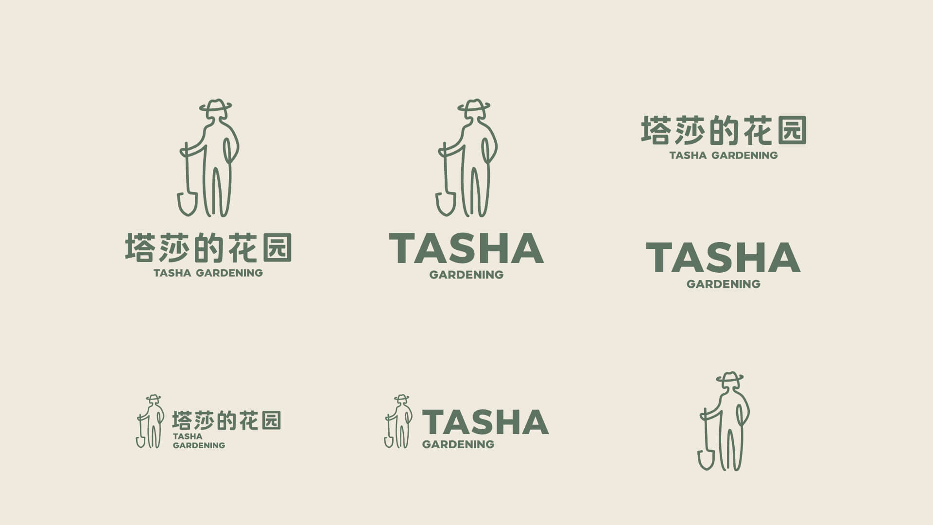
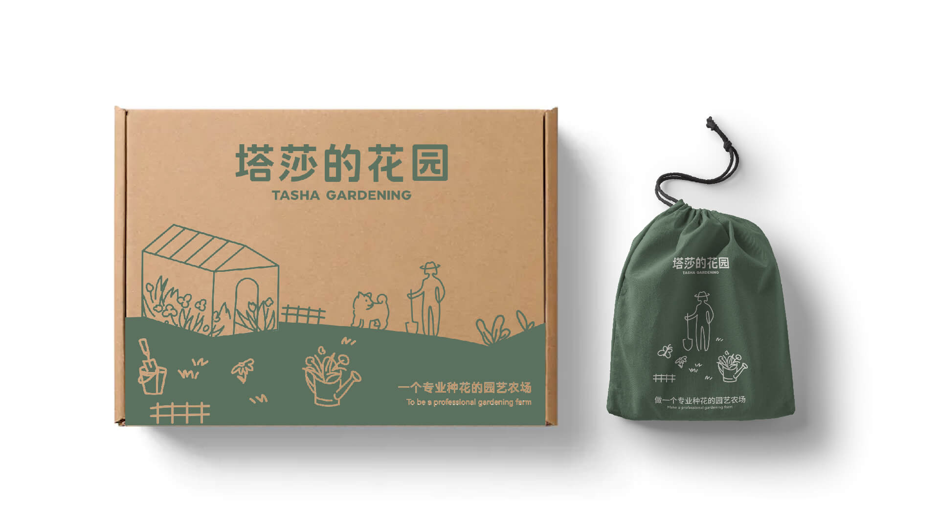
塔莎的花园 | Tasha
ART DIRECTOR: Vincent Xu
DESIGNER: Qu menghuan
YEAR: 2023
CLIENT: Tasha
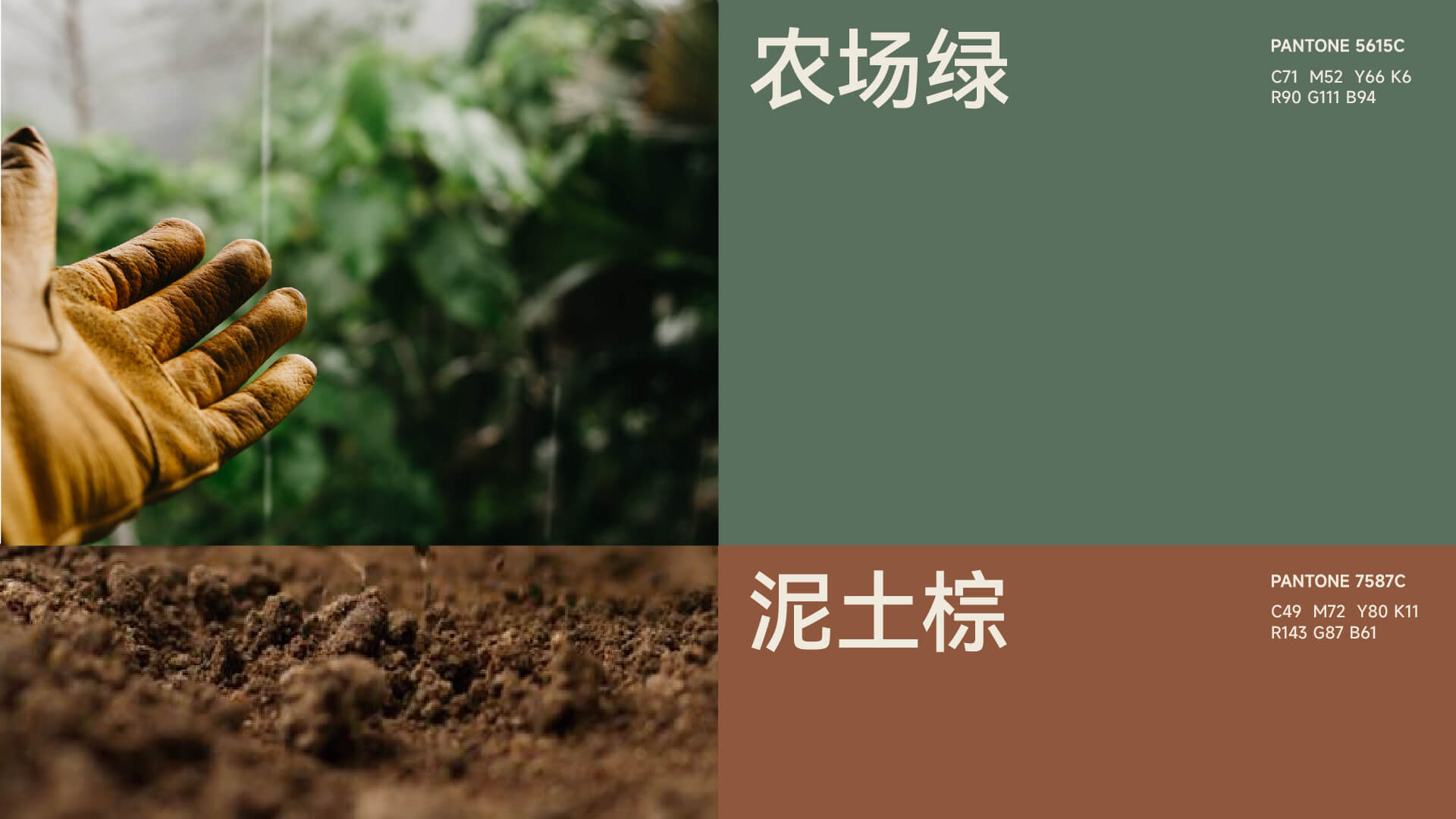
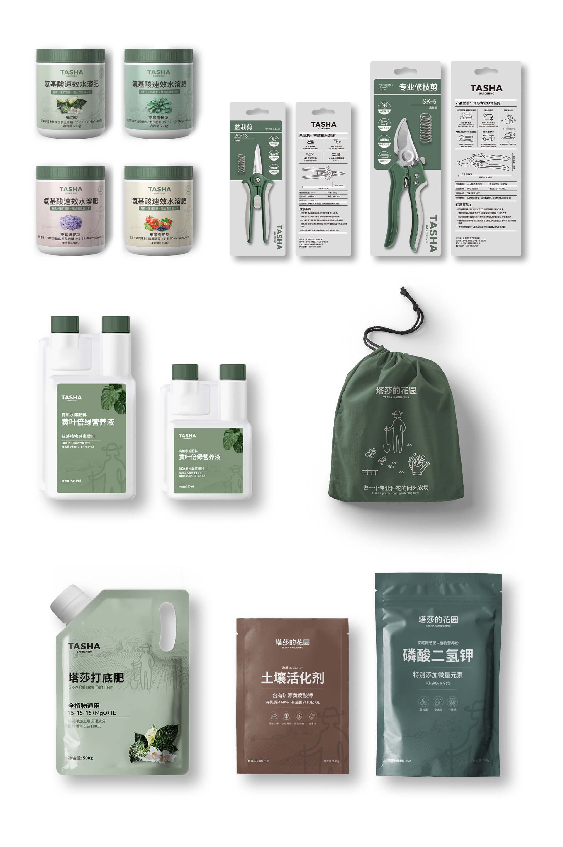
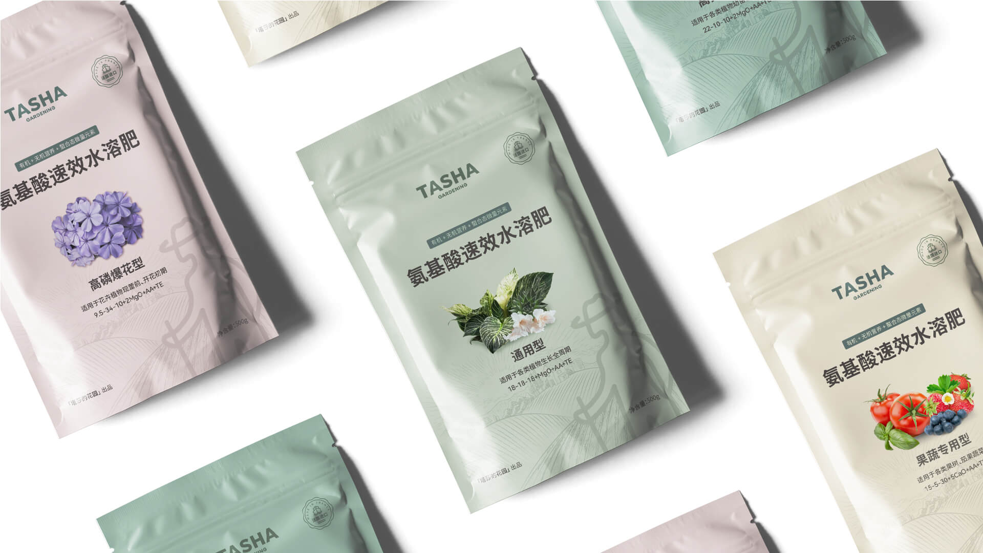
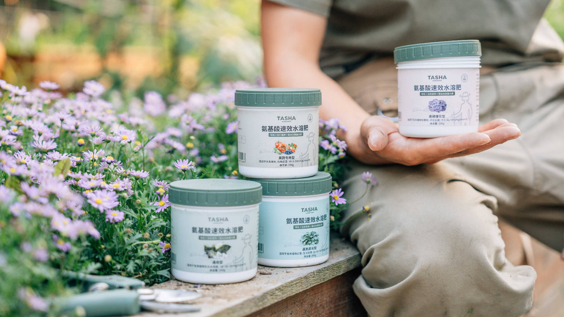
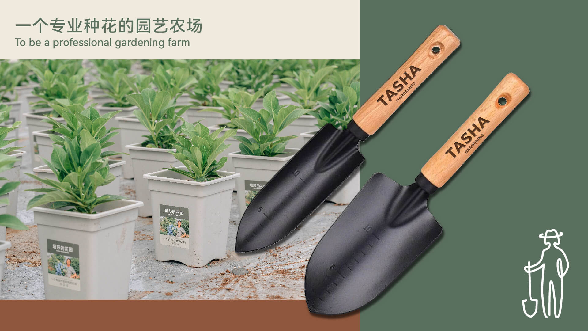
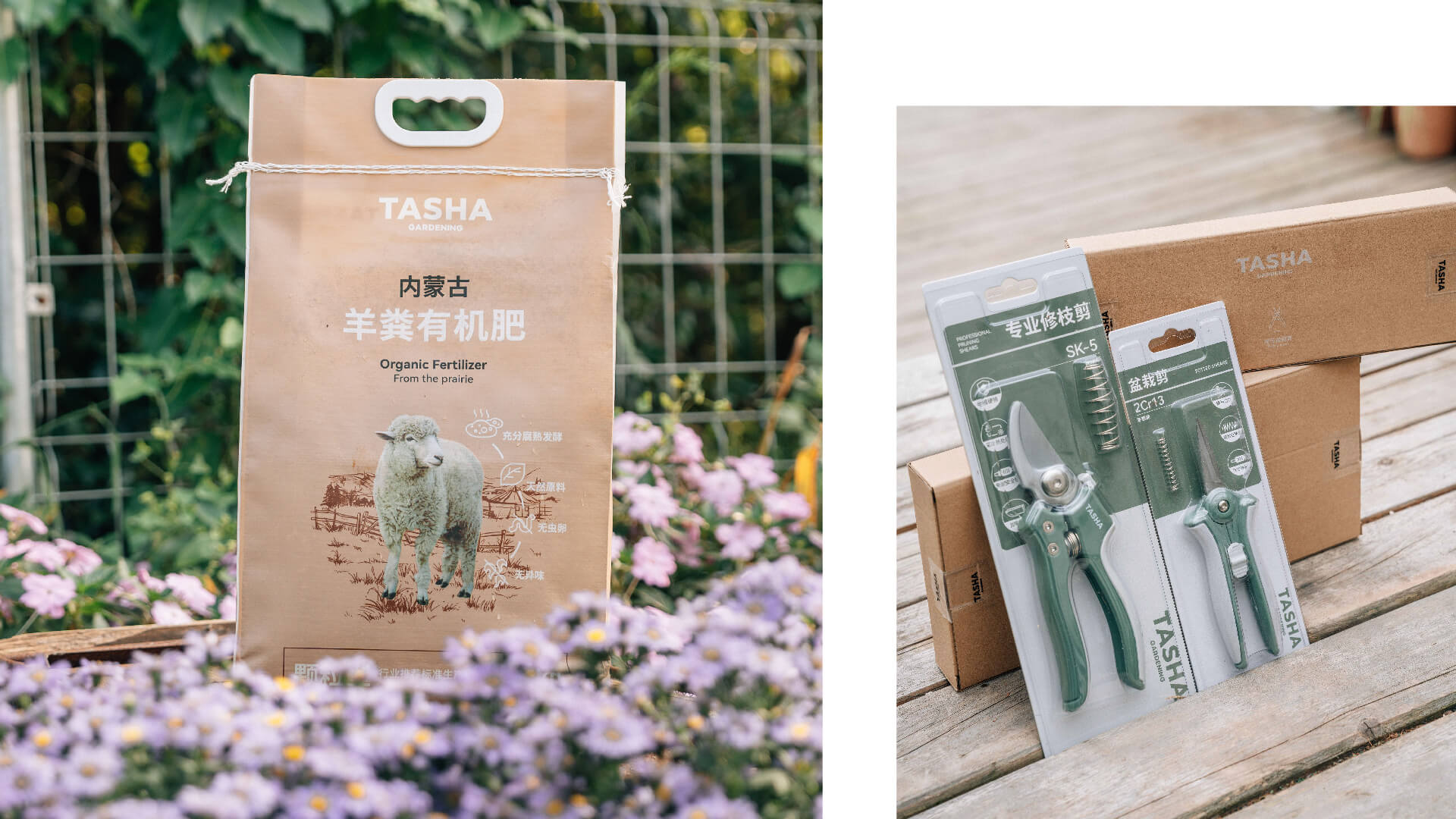
塔莎的花园是一家有着自建园艺农场的园艺品牌,不止为消费者提供优质的产品和专业的服务,更希望传达出园艺的美好和温暖的情感特质。
品牌主理人塔莎先生十年的经营,用品质和专业让塔莎的花园积累了一大批忠实的老客户。下一步需要建立更多与消费者产生情感共鸣的专业园艺形象,系统化的视觉资产。
通过对品牌的系统分析和调研后,我们将「专业」与「美好」定义为品牌核心。
标志形象识别:农场园艺师-塔莎先生
在logo、色彩、图形、包装的创作中,紧紧围绕“一个专业种花的园艺农场”
通过系列的去展示表达,将塔莎的花园这些真实的园艺日常、美好完整传递给消费者。
Tasha is a gardening brand with a self-built gardening farm. It not only provides consumers with high-quality products and professional services, but also hopes to convey the beauty and warm emotional qualities of gardening.
The brand manager, Mr. Tasha, has accumulated a large number of loyal old customers through quality and professionalism in his ten years of operation. The next step is to establish more professional gardening images and systematic visual assets that resonate emotionally with consumers.