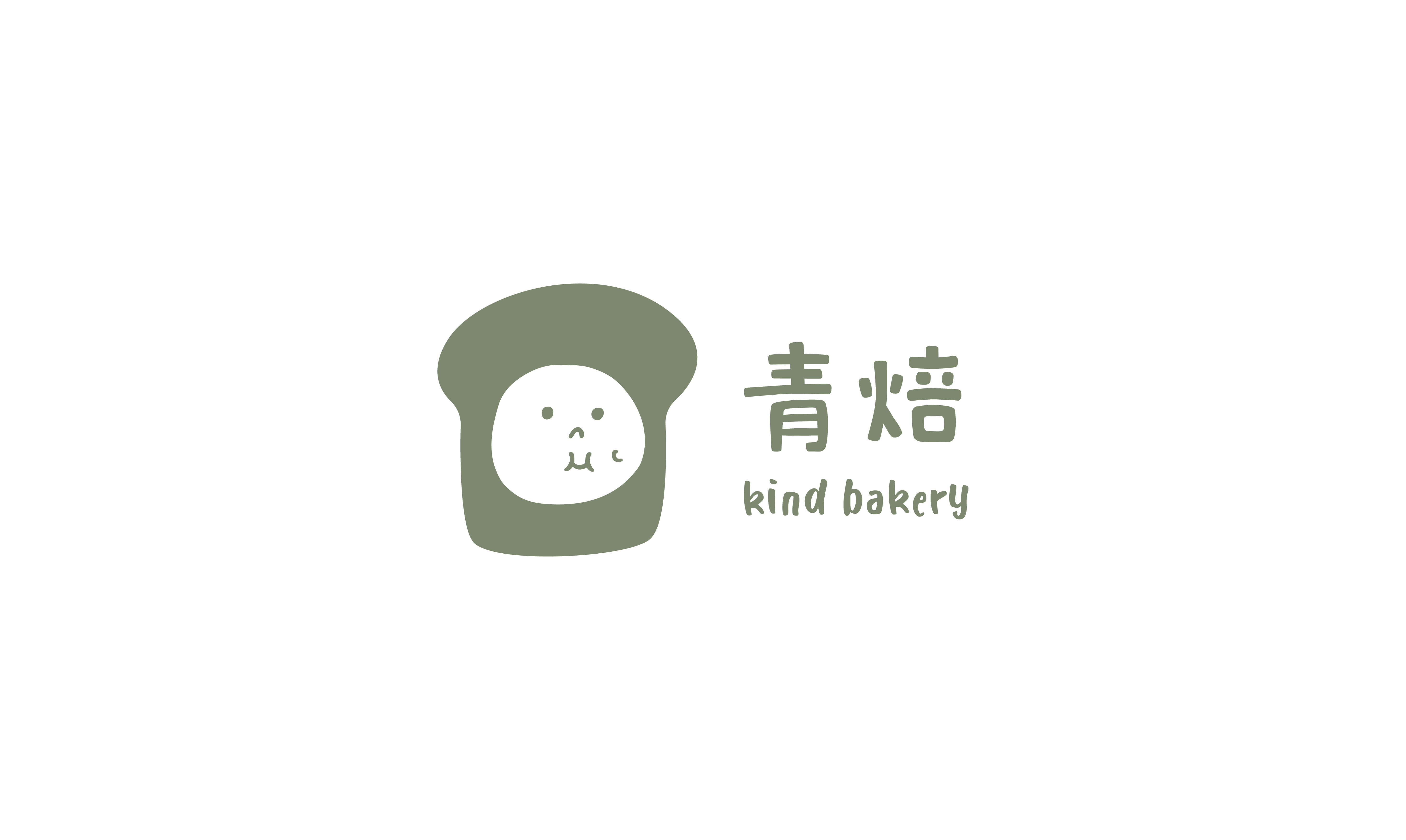
青焙 | Kind Bakery
ART DIRECTOR: Vincent Xu
DESIGNER: Gu jingyi & Zhang qianyu
YEAR: 2020
INTEROR : ZooCN Lab
LOCATION: Suzhou
CLIENT: Kind Bakery
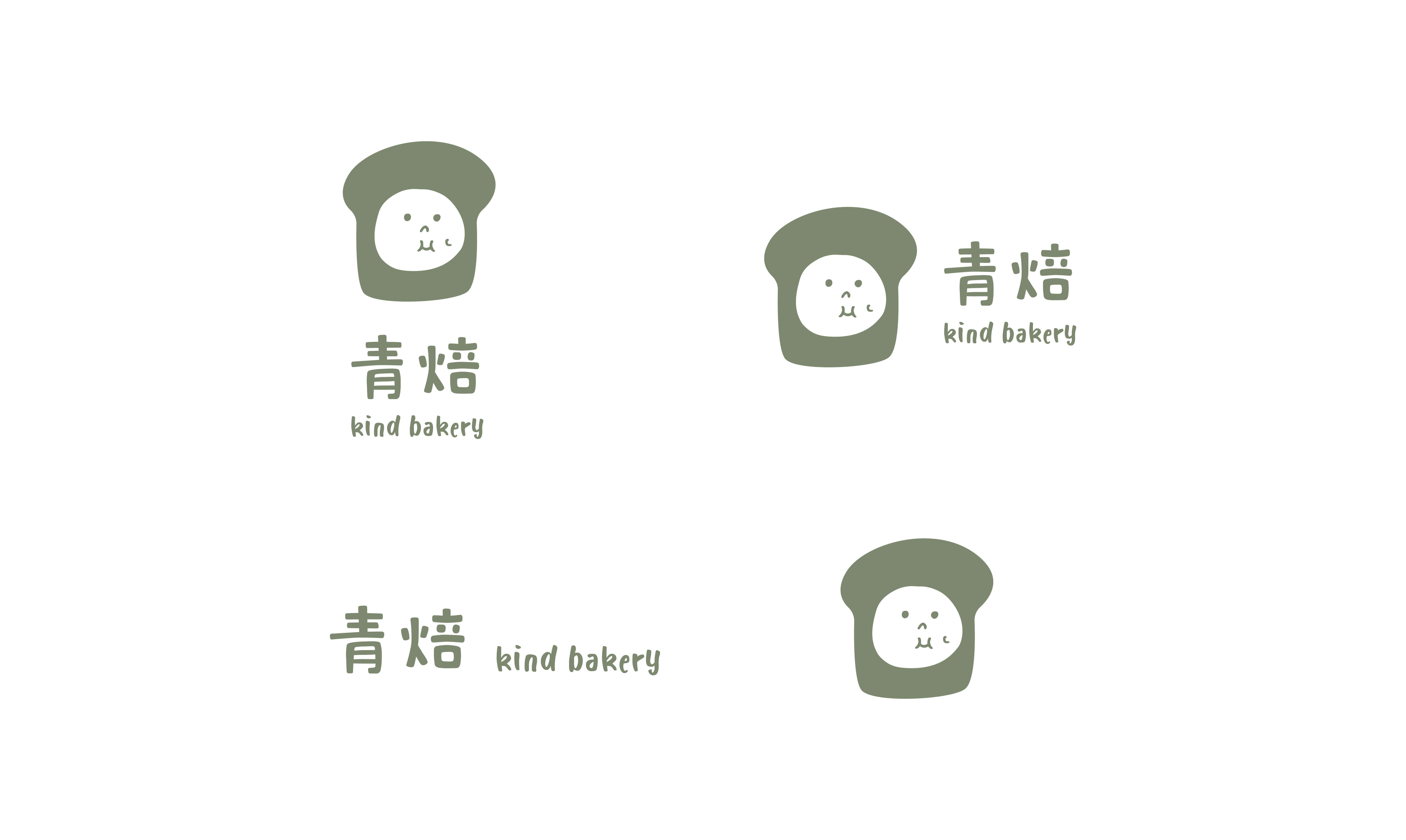
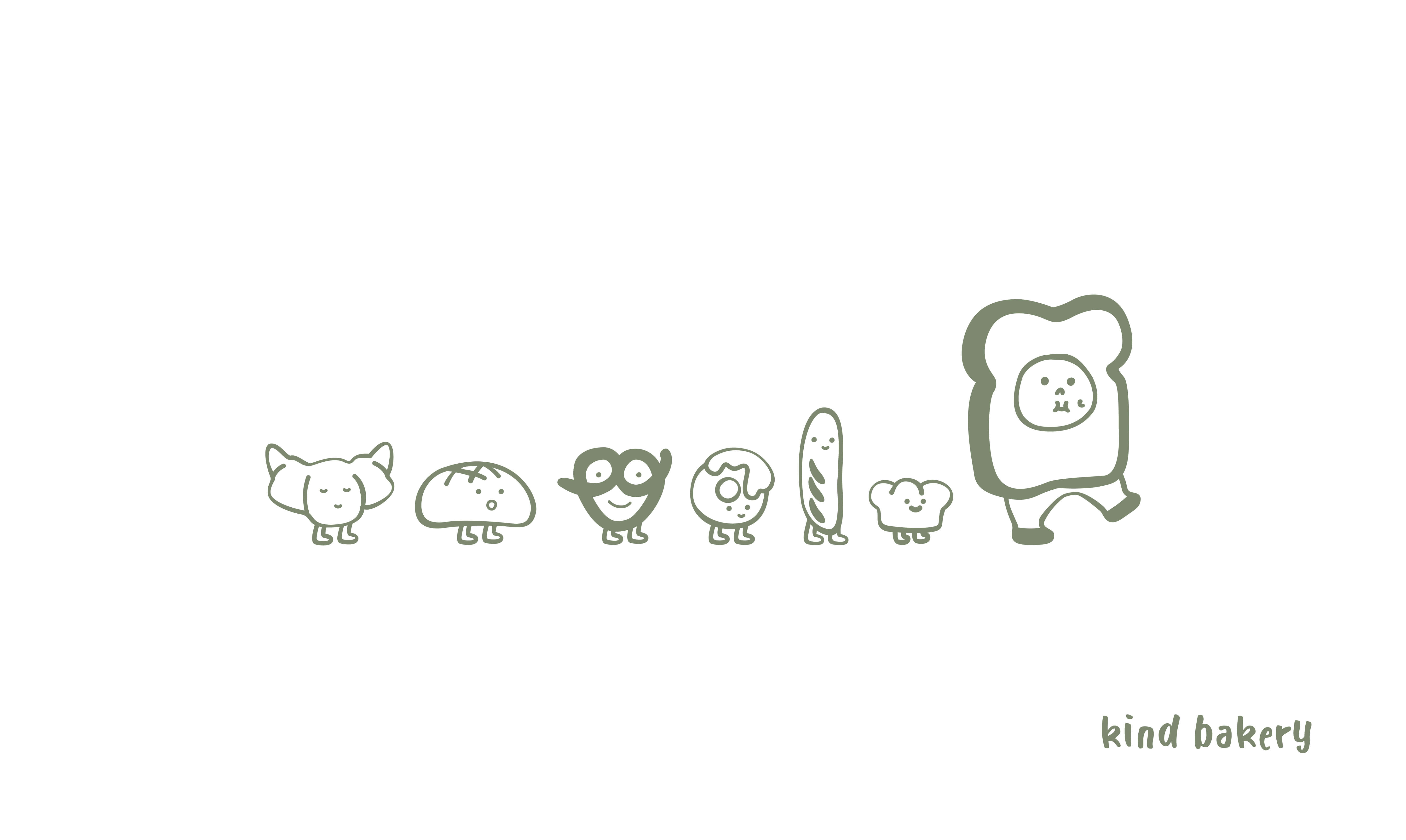
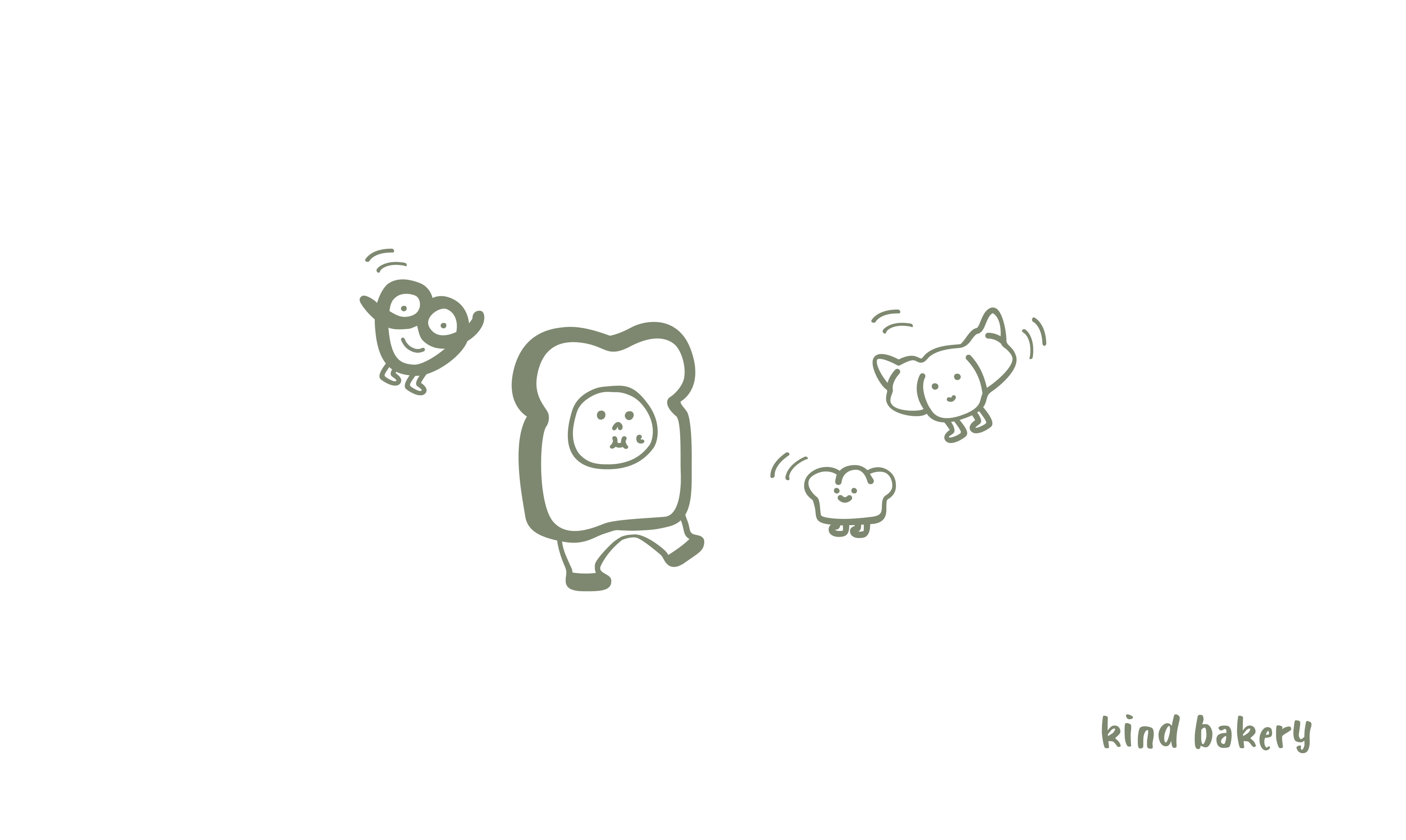
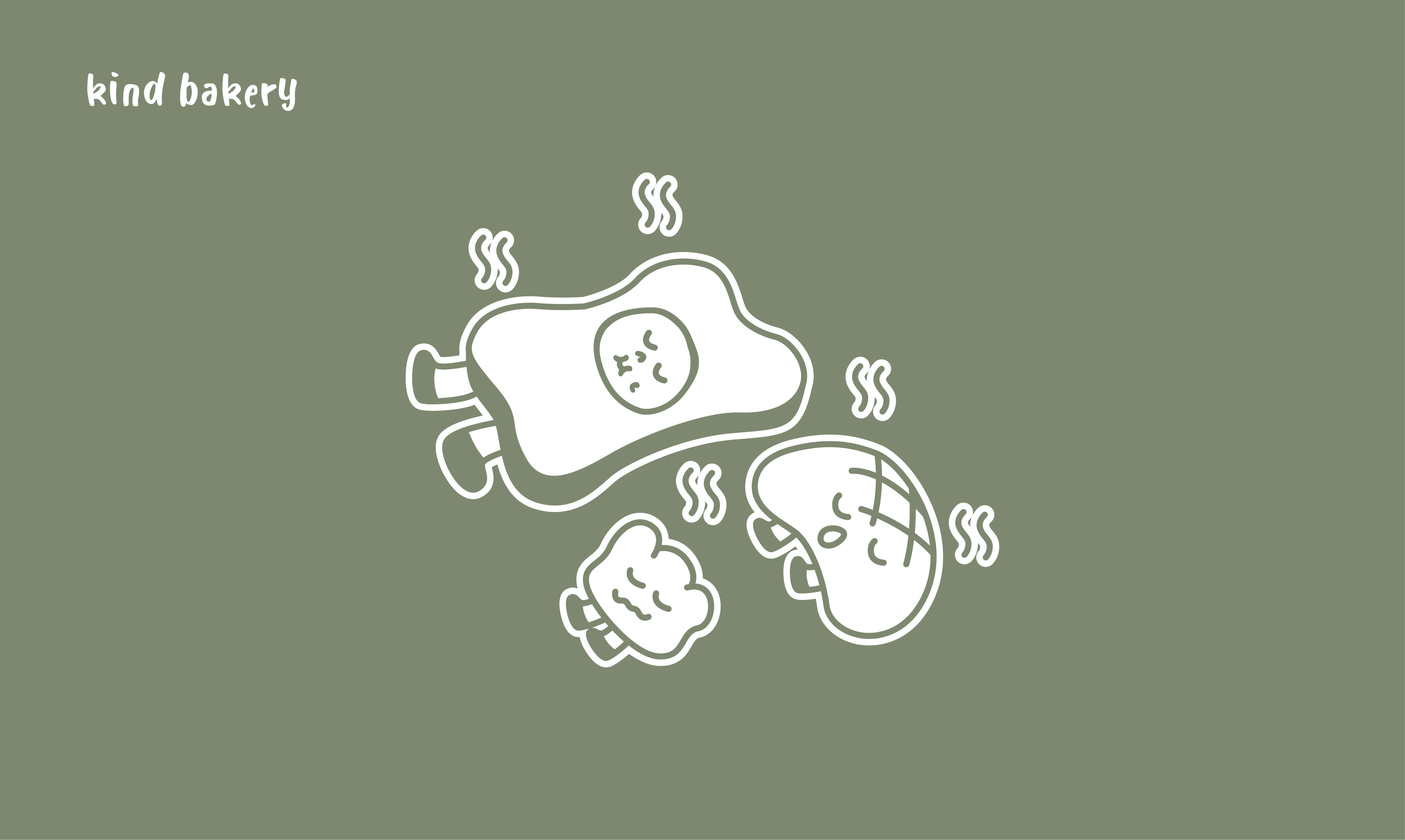
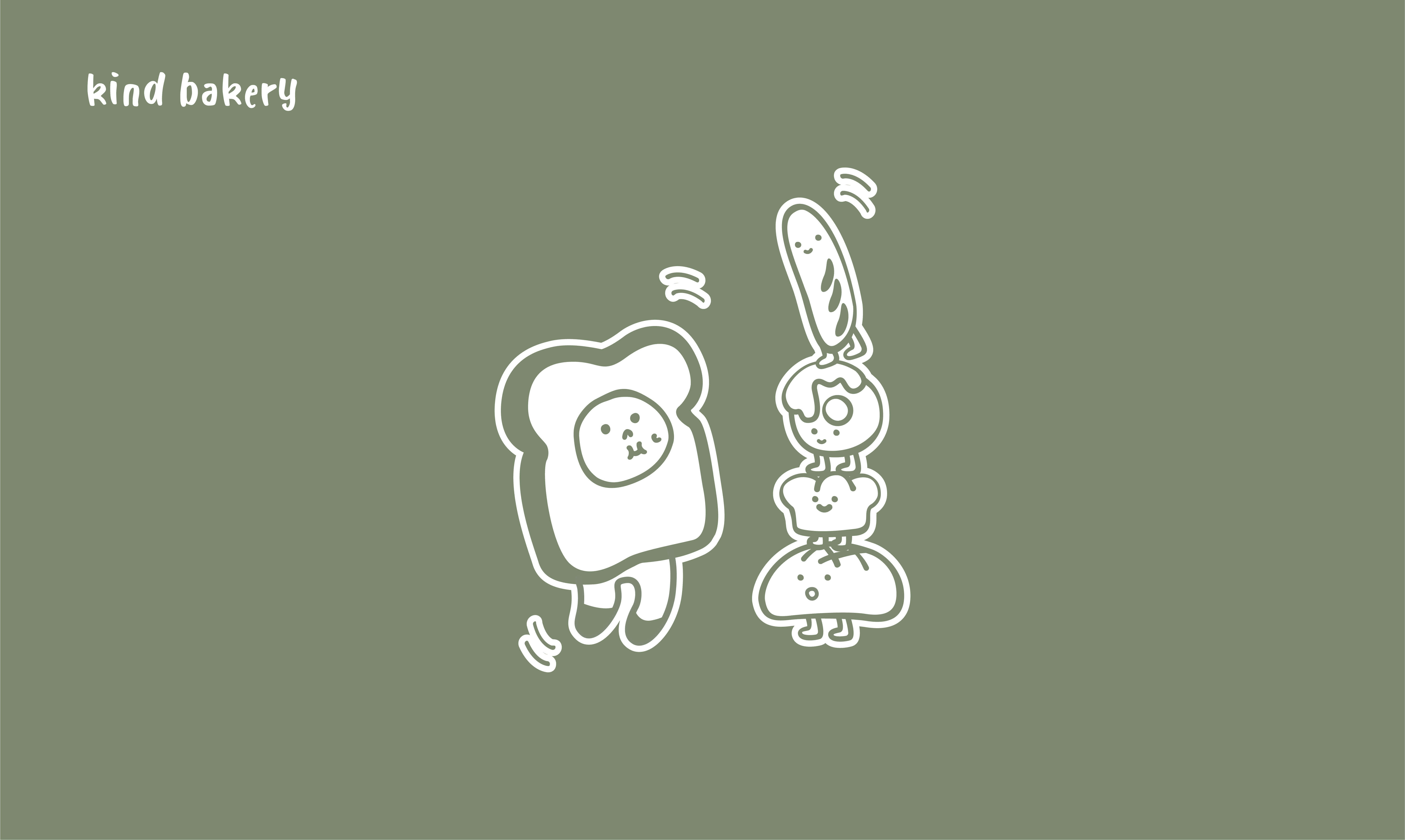
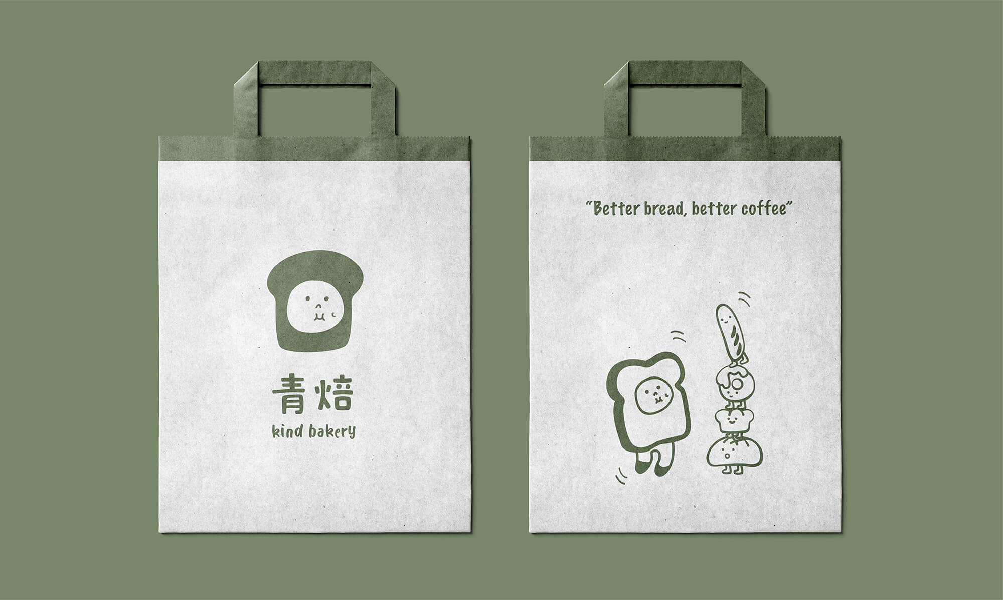
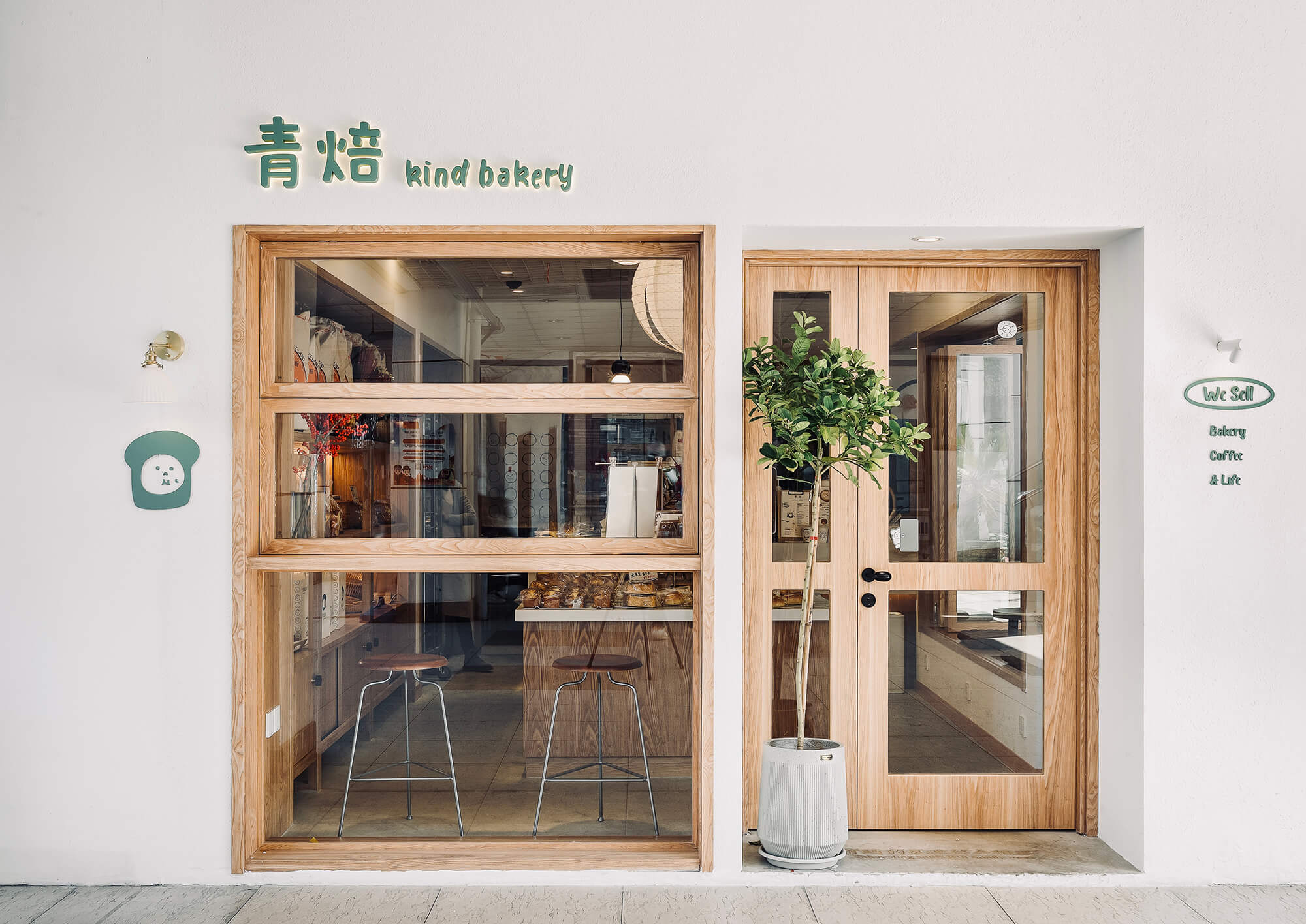
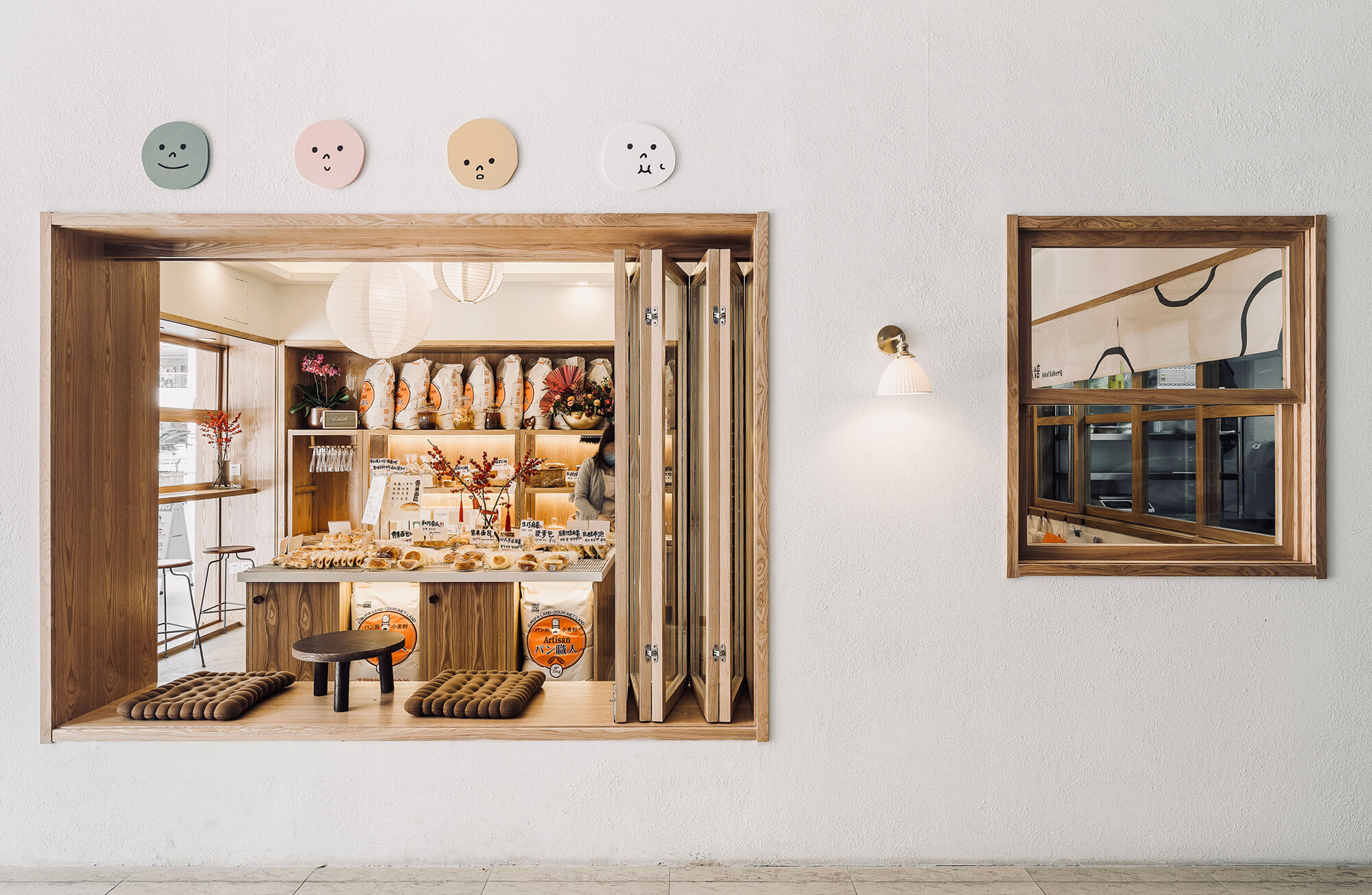
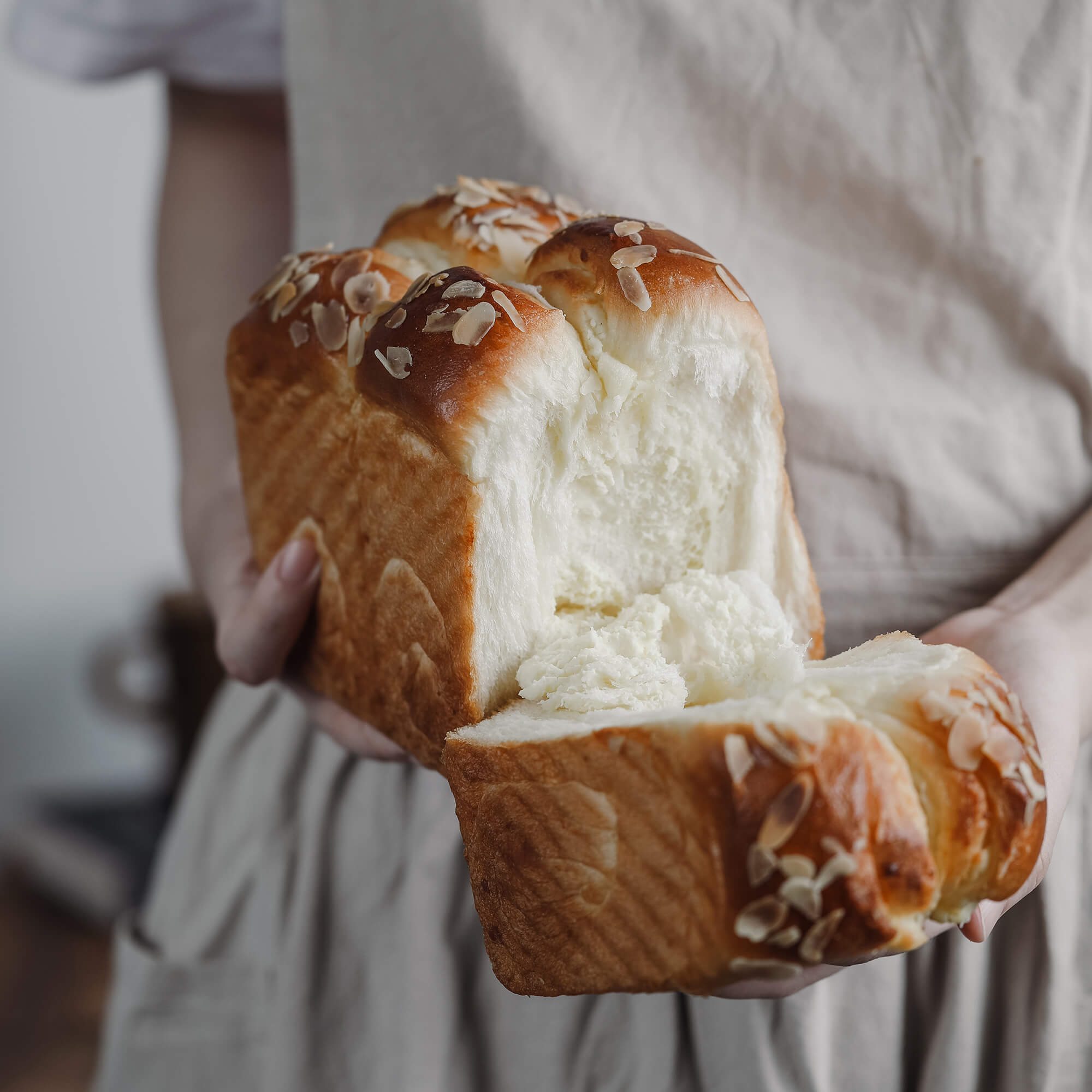
青焙是一家以日式面包为主打的烘焙店,经过多年的口碑积累,赢得了一大批老客户的忠实信赖。此次品牌升级重新定位品牌视觉,规范元素和品牌色,让视觉和产品能够更好的融合接洽,便于消费者的认知和传播。图形部分以创始人女儿为原型,保留其「圆脸、小酒窝」的可爱特征,抽象的描绘出一个头戴面包的可爱形象。通过不规则的线条,设计对应的图形及文字,体现品牌的亲和力和温度。
Kind Bakery is a bakery that focuses on Japanese-style bread. After years of accumulation of word of mouth, it has won the loyal trust of a large number of old customers. The brand upgrade repositions the brand vision, standardizes the elements and brand colors, so that the vision and products can be better integrated and communicated, which is convenient for consumers' recognition and communication. The graphic part is based on the founder's daughter, retaining its cute characteristics of "round face and small dimples", abstractly depicting a cute image wearing bread. Through irregular lines, the corresponding graphics and text are designed to reflect the affinity and temperature of the brand.