佳佳甜品 | KaiKai Dessert
ART DIRECTOR: Vincent Xu
DESIGNER: Mo Luyao
YEAR: 2017
LOCATION: Taiwan
CLIENT: KaiKai Dessert
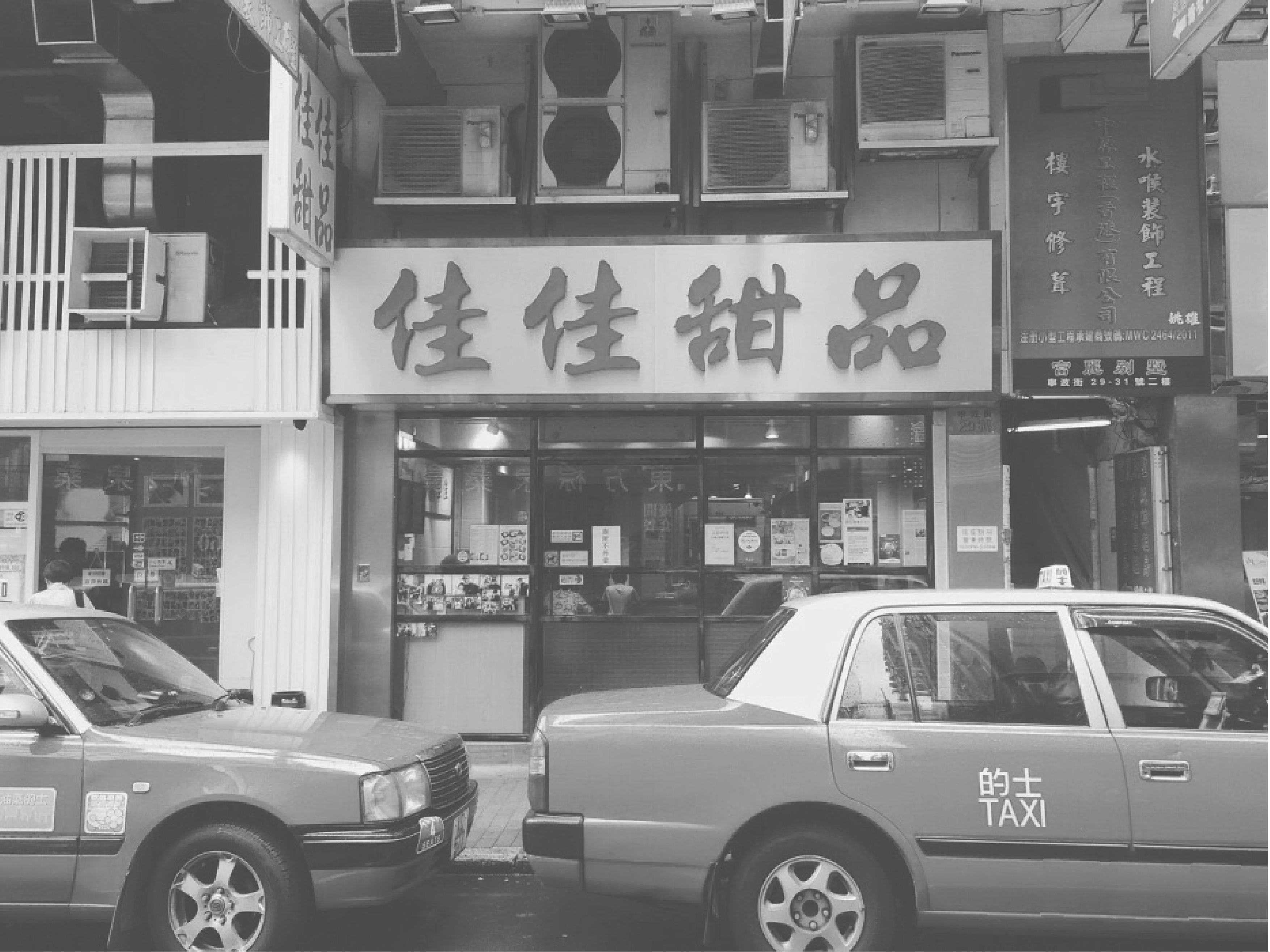
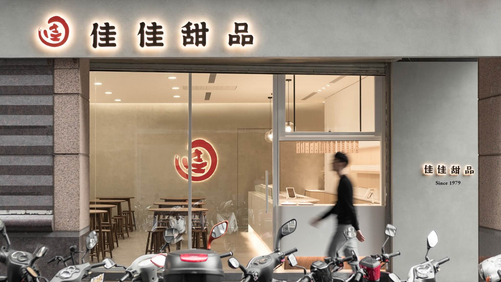
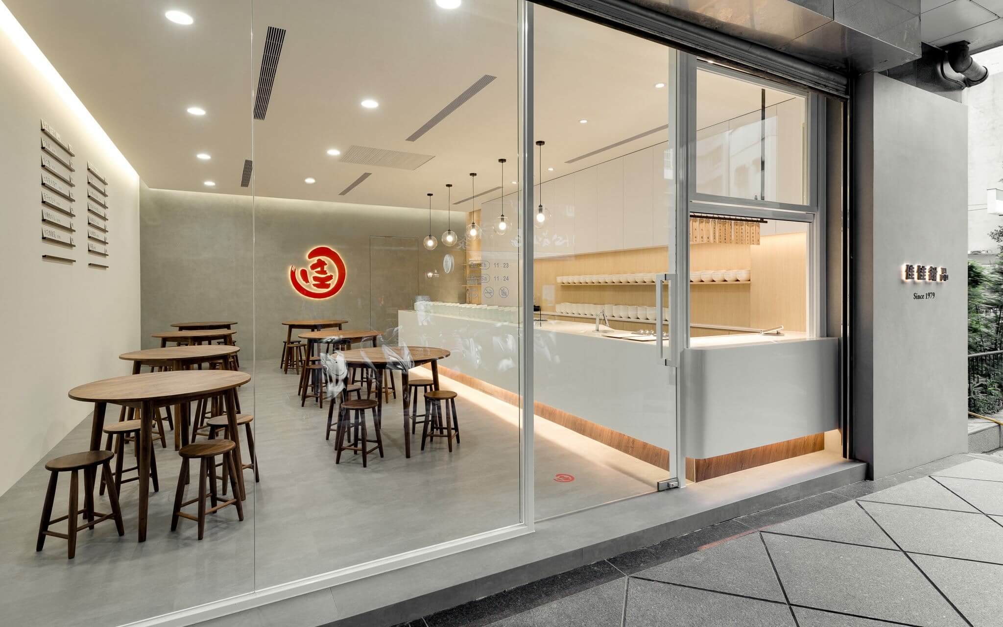
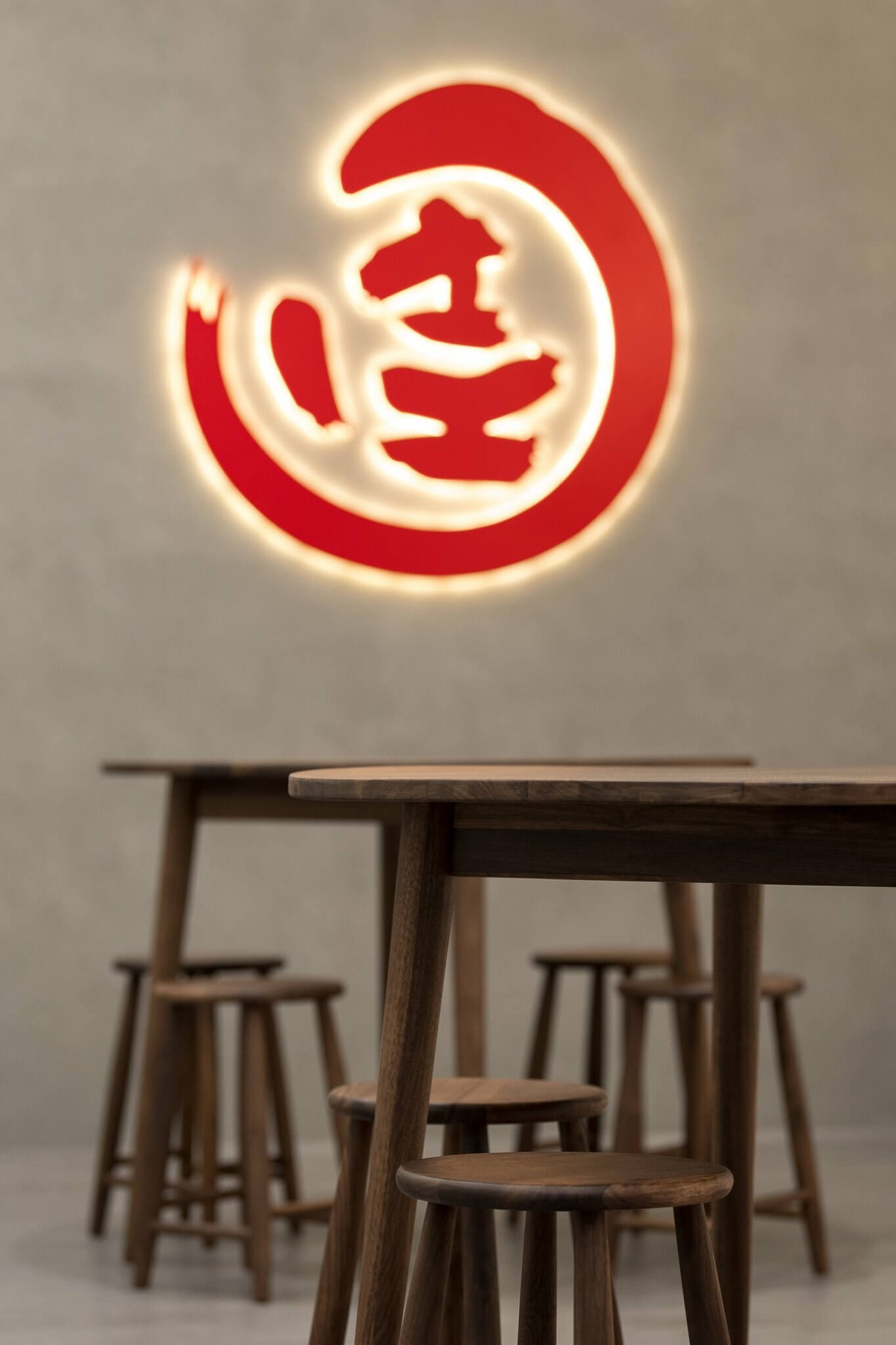
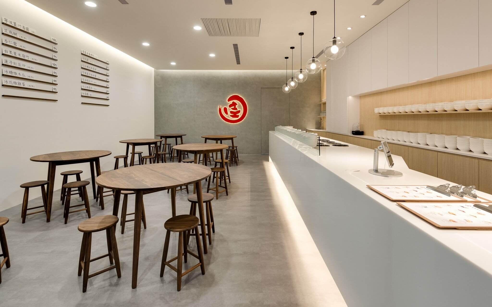
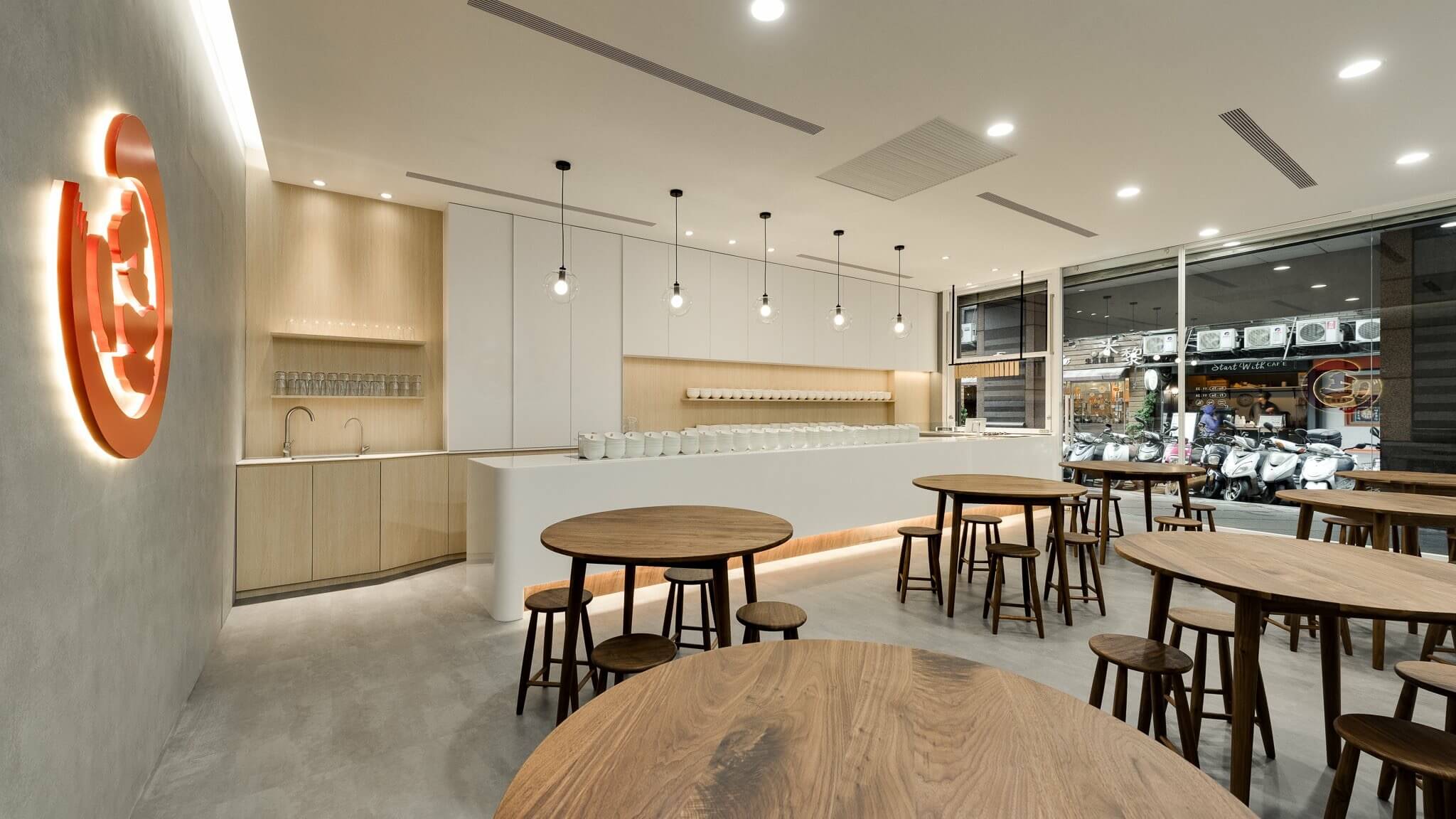
佳佳甜品始创于1979年,老店位于香港九龙,连续3年获得香港米其林推荐中式甜品。此次委托品牌升级,开拓首家分店位于台湾。在设计中文字体的时候,借鉴了老香港街头的招牌字体,同时进行细节改良,让字体保留传统的同时在细节上又带有一点甜品糯糯的质感。标志部分以中文“佳”作为主图形,通过设计,将K、A、I三个字母隐藏在图形中,形成一个独特的图形,增加品牌的识别性。新的视觉既现代又保留传统气息。选取红色作为主色调,红色是中国人普遍喜爱的颜色,同时暖色调会增加人的食欲。
KaiKai Dessert was founded in 1979. The old shop is located in Kowloon, Hong Kong. It has been awarded the Chinese dessert of Michelin in Hong Kong for three consecutive years. The commissioned brand upgrade, the first branch opened in Taiwan. When designing Chinese fonts, I borrowed the signature fonts from the streets of old Hong Kong and improved the details to keep the fonts traditional and with a little sweetness in the details. The logo part uses Chinese "good" as the main graphic. Through design, the three letters K, A and I are hidden in the figure to form a unique figure, which increases the recognition of the brand. Have affinity and retain the traditional atmosphere. The color of the brand is red as the main color, red is the color that is popular among Chinese people, and the warm color will increase the appetite.