Coconut Shake | 木双耳椰
ART DIRECTOR: Vincent Xu
DESIGNER: Qu Menghuan
YEAR: 2023
LOCATION: Shanghai
CLIENT: Coconut Shake
当一只椰子开始疯狂扭屁股,我就知道事情一定不简单。
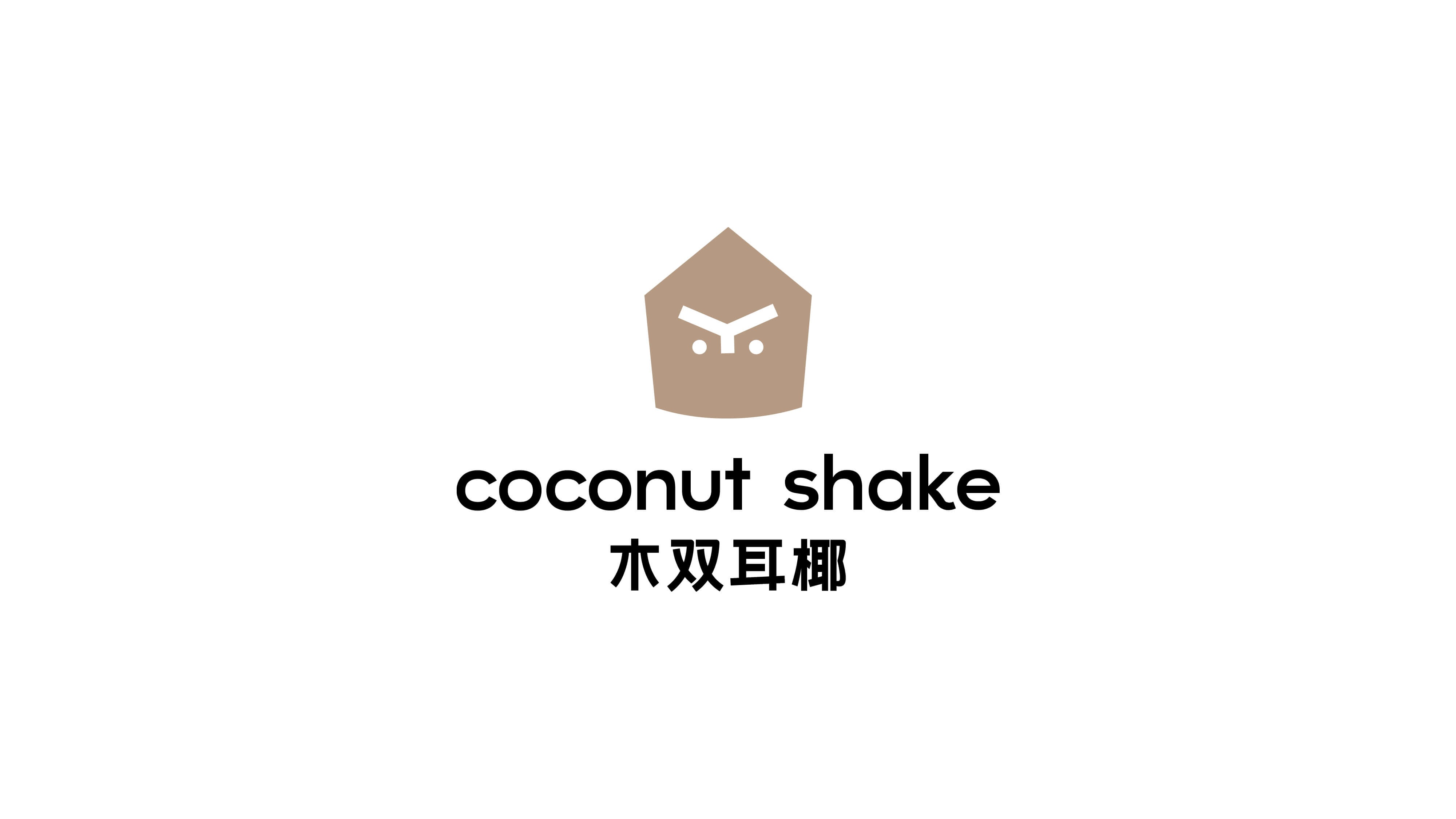
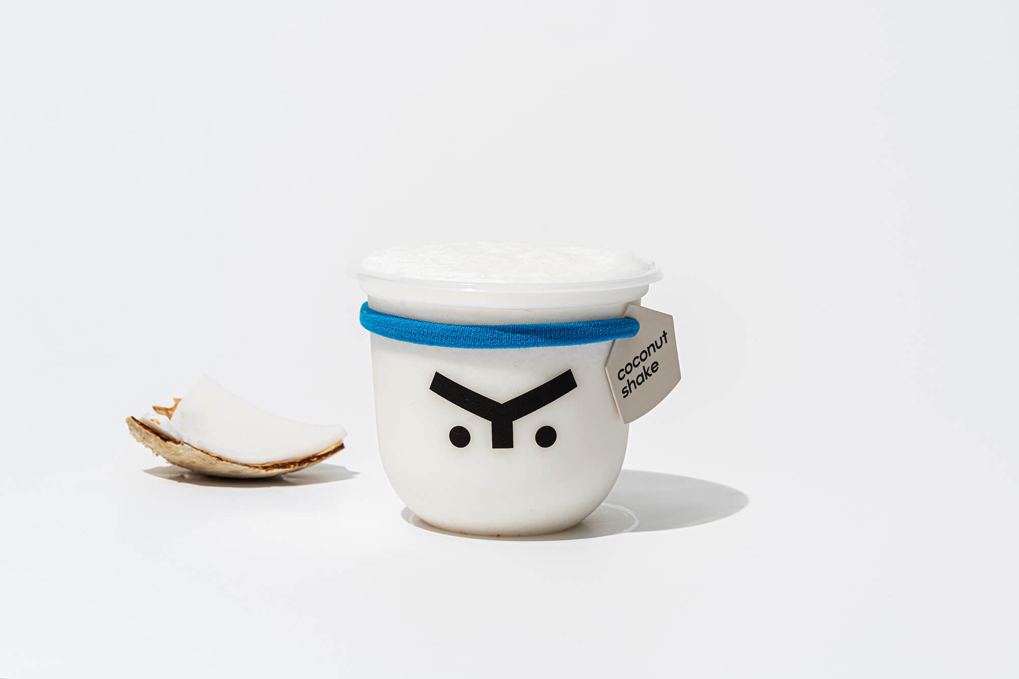
Coconut Shake 木双耳椰是一个以健康无添加为坚持理念的品牌,为了传达和凸显这一理念,logo图形为一个简约的五边形来代表产品核心椰子。
品牌字体也以简洁感,稳重感为主,呼应「健康无添加」的理念。
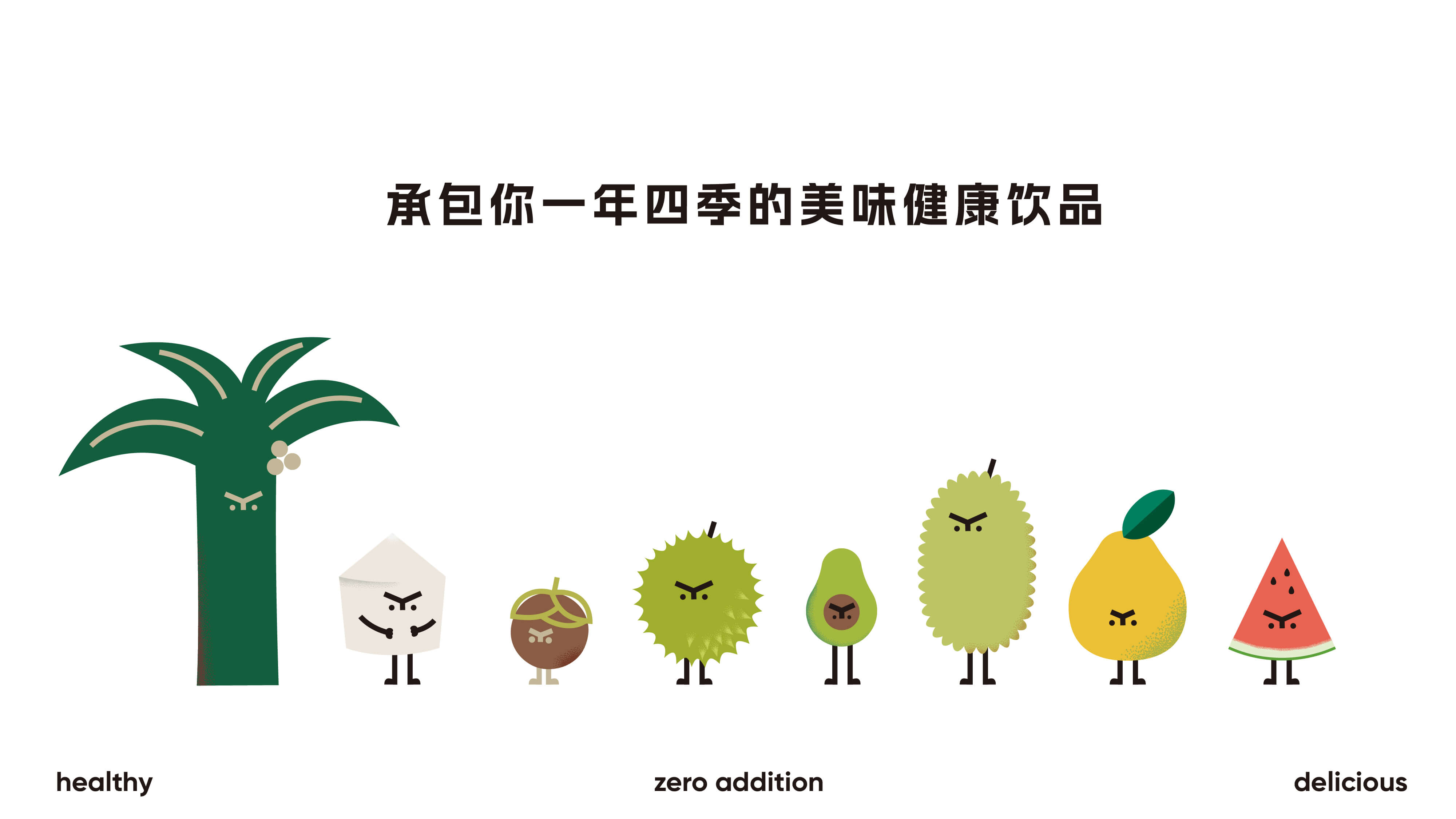
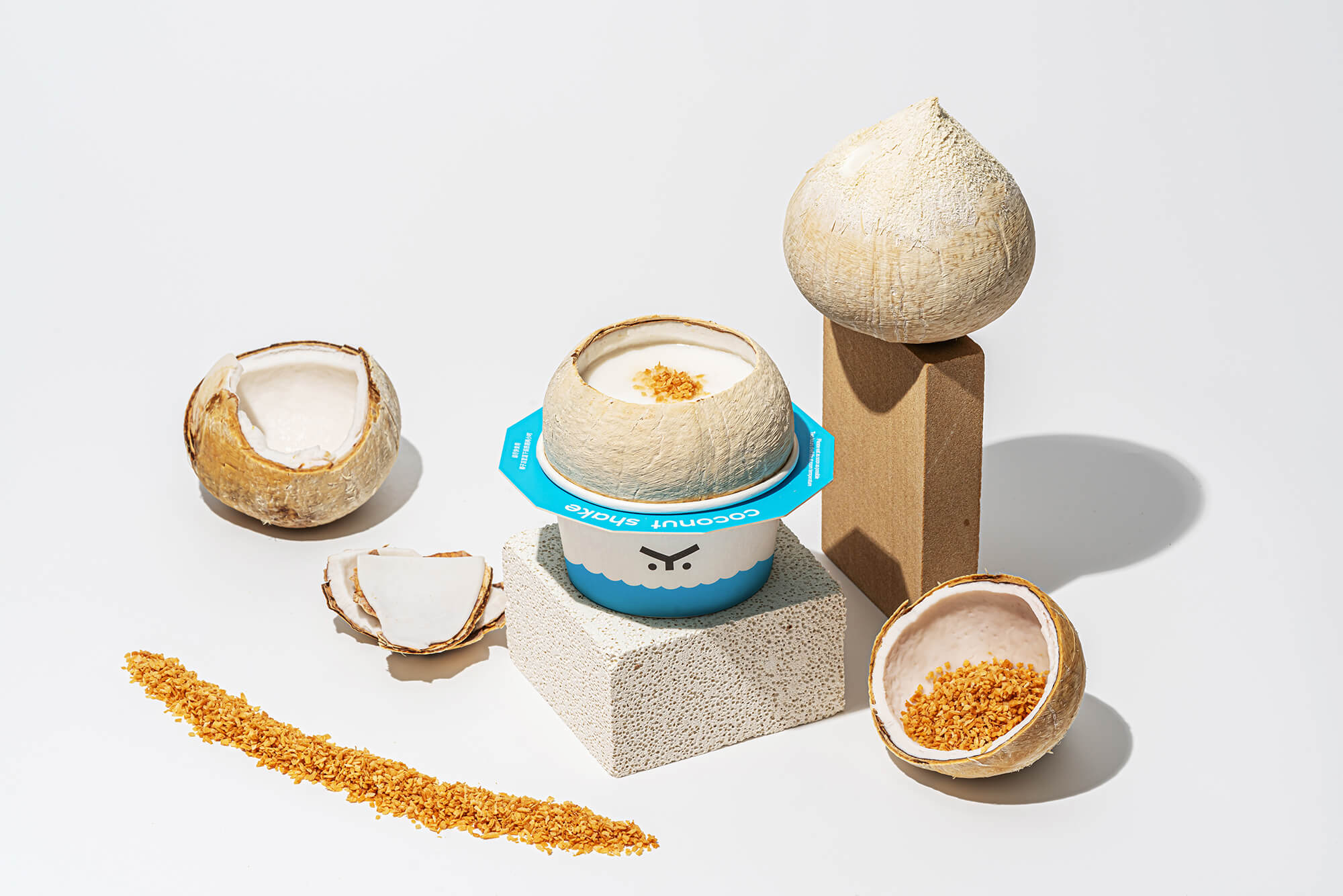
其次,从logo图形延展出可爱的椰子形象,并与其搭配设计了一系列的热带水果小兄弟,以此提升辨识度和活力,为消费者传达健康、轻松、快乐的情绪。
When a coconut starts to twist its butt like crazy, I know it's not easy.
Coconut Shake is a brand that adheres to the concept of being healthy without additives. In order to convey and highlight this concept, the logo graphic is a simple pentagon to represent the core coconut of the product.
The brand font is also based on a sense of simplicity and stability, echoing the concept of "health without additives".
Secondly, the cute coconut image is extended from the logo graphic, and a series of tropical fruit brothers are designed to match it, so as to enhance the recognition and vitality, and convey healthy, relaxed and happy emotions to consumers.