宫西春晓✖️宫西牛神✖️我的收藏
ART DIRECTOR: Vincent Xu
DESIGNER: FZ Yao & Zeng Xinyi
YEAR: 2021
LOCATION: Suzhou
INTERIOR: New Concept Design
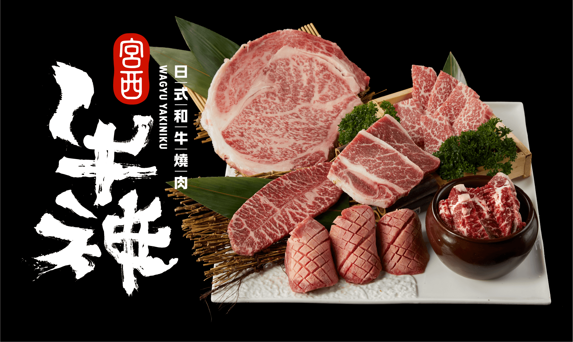
CLIENT: ShenGong
NO.1 宫西春晓
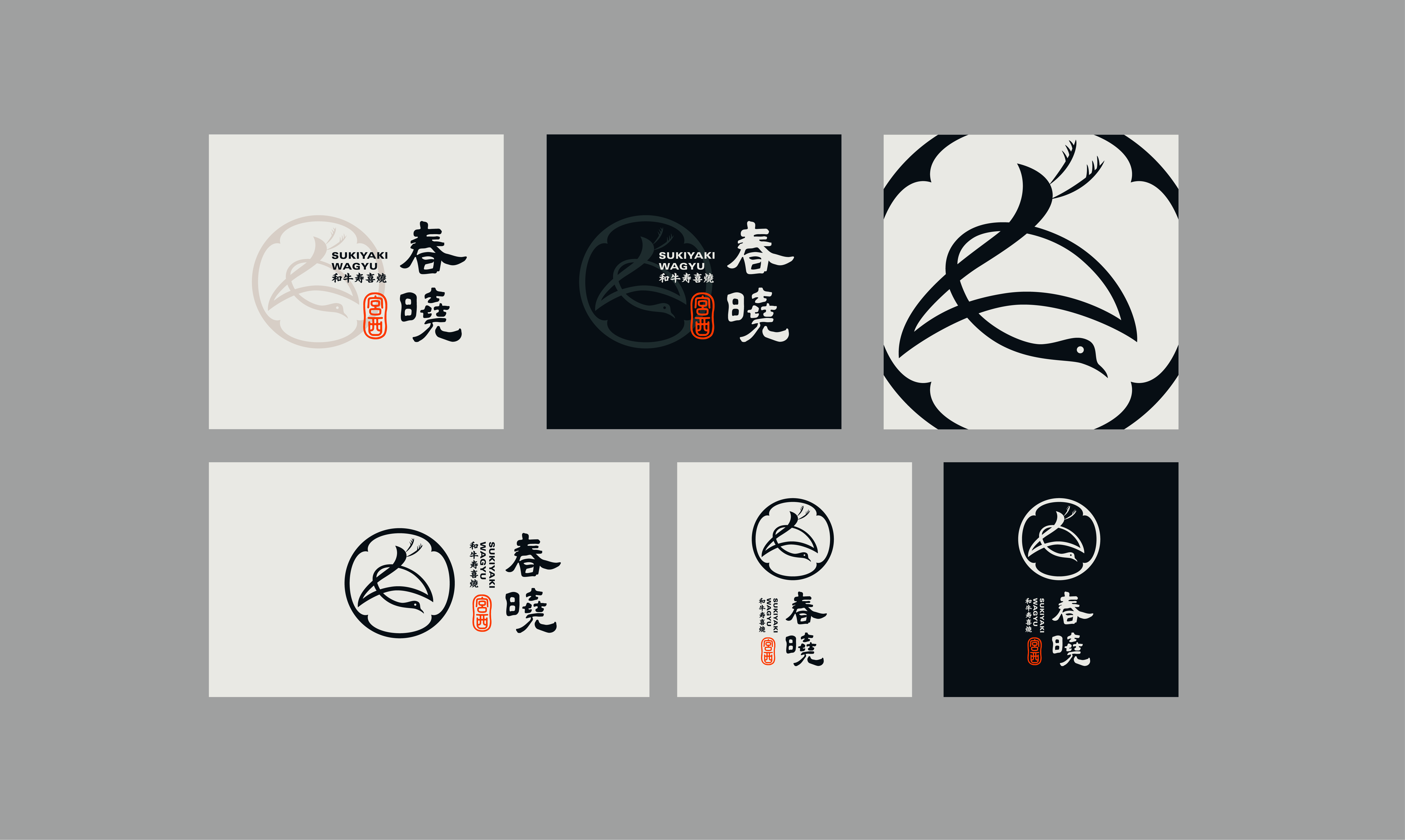
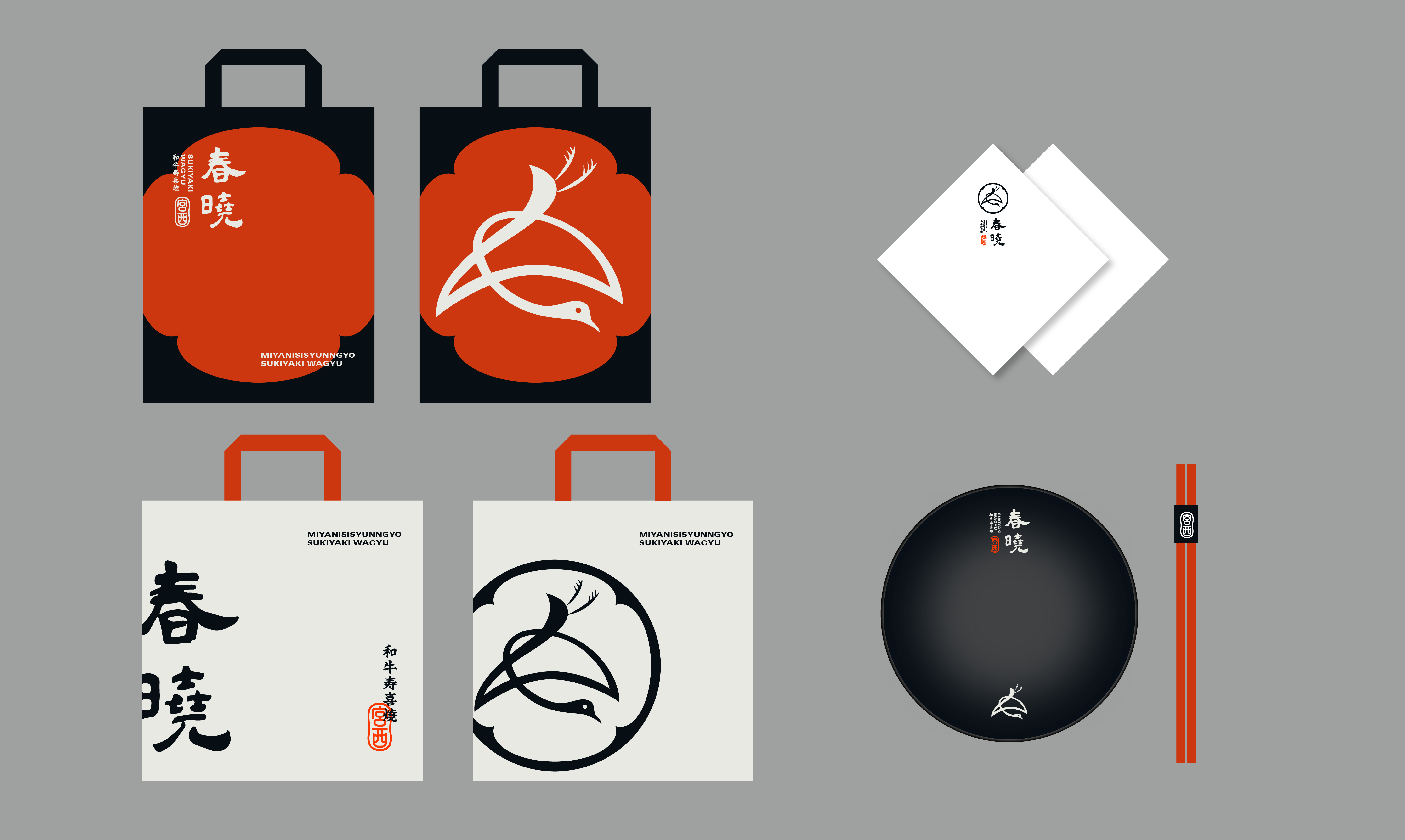
宫西春晓作为宫西牛神的姊妹品牌, 以「真正日式和牛寿喜烧」为品牌核心,定位和客单价高于牛神。
如何保持品牌关联性的同时又能彰显各自的定位和调性。于是将「宫西」这一抬头,分别做成印章的形式,
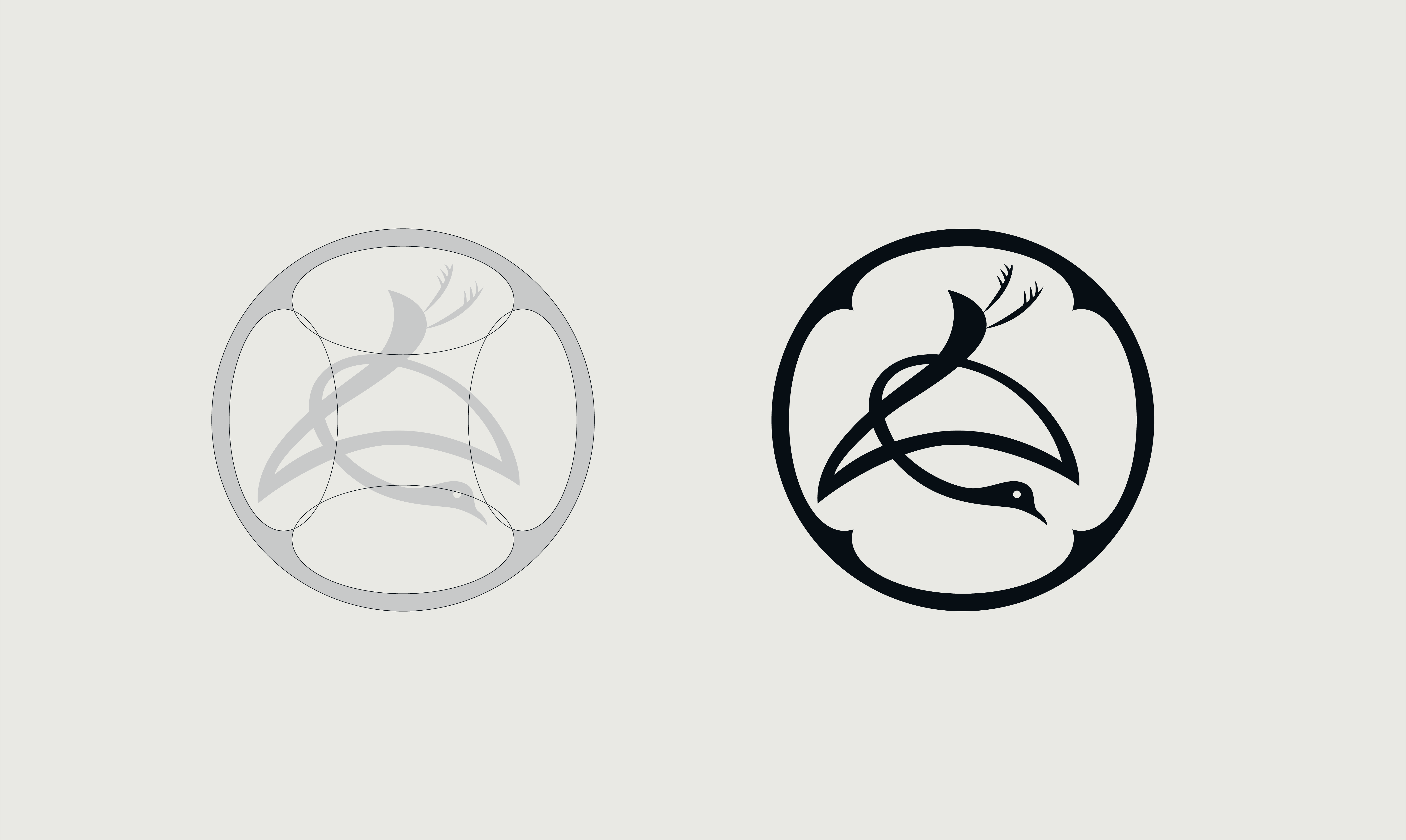
单独拎出主打名称放大。春晓的图形标志来源于日式家徽章「鹤纹」,鹤纹在日本文化中象征吉祥、幸福、优雅,
与品牌希望传递的理念相契合,同时又能体现品牌的正宗感和品质感,整体风格简洁、精致。
As the sister brand of Miyani Niu God, Miyoshi Haruaki takes "Real Japanese Wagyu Sukiyaki" as its core brand, and its positioning and unit price are higher than Niu God.
How to maintain brand relevance while also highlighting their respective positioning and tonality. So I raised the head of "Miyanishi" and made them into the form of seals.
Pull out the title name separately to zoom in. Chunxiao’s graphic logo is derived from the Japanese-style house emblem "Crane Pattern", which symbolizes auspiciousness, happiness, and elegance in Japanese culture.
It is consistent with the concept that the brand hopes to convey, and at the same time can reflect the brand's sense of authenticity and quality, and the overall style is simple and refined.


NO.2 宫西牛神
区别于春晓的高端与雅致,牛神想要呈现出一种“吃豪爽炸裂美味烤肉”的品牌性格。
灵感来自日本的“万物皆神明”的理念,将文字设计与图腾设计融为一体,把狂野的牛神二字拆分重组后,
便成为了头戴武士头盔,头上发火,目露凶光的和牛的神明形象,作为“牛神”品牌的品牌图腾。
配合店内LED动画的快节奏品牌展示,烘托店内火热的日式烤肉气氛。
Different from Chunxiao's high-end and elegant, Niu Shen wants to present a brand character of "eating bold and delicious grilled meat".
Inspired by the Japanese concept of "all things are gods", the text design and totem design are integrated, after splitting and reorganizing the wild bull god,
It became the image of a wagyu god wearing a samurai helmet, angry on his head, and a fierce look, as the brand totem of the "Bull God" brand.
With the fast-paced brand display of LED animation in the store, it sets off the hot Japanese-style barbecue atmosphere in the store.


NO.3 我的收藏
我的收藏作为网红餐厅,融合了日式料理和中式菜品的长处而深受消费者的喜爱。
客群大多为情侣和年轻三口之家。原本老的logo太过于中式,并没有品类名,在传播上会有一定困扰。
此次升级重新定义了其为「创意餐厅」,并以玫瑰作为品牌图腾,玫瑰的图形标志中隐藏了刀和叉的造型。
在店铺中,每一张桌上会伴有一支玫瑰,贯穿整个餐厅。标准字的设计,结合了趣味性和独特性,给人一种玩味的感觉,但又不失精致感。墨绿搭配古铜色的品牌色,也给人以优雅小资的感受。升级后的调性更为年轻,「希望你会喜欢」。
As an Internet celebrity restaurant, my collection combines the strengths of Japanese and Chinese dishes and is deeply loved by consumers.
Most of the customers are couples and young families of three. The original old logo is too Chinese, and there is no category name, which will cause some problems in communication.
This upgrade has redefined it as a "creative restaurant" and used the rose as the brand totem. The shape of the knife and fork is hidden in the graphic logo of the rose.
In the shop, each table will be accompanied by a rose, which runs through the entire restaurant. The design of standard characters combines fun and uniqueness, giving people a sense of playfulness, but without losing a sense of refinement. Dark green and bronze brand color also give people an elegant petty bourgeoisie feel. The upgraded tone is younger, "I hope you will like it."


